Painting Large on PastelBord

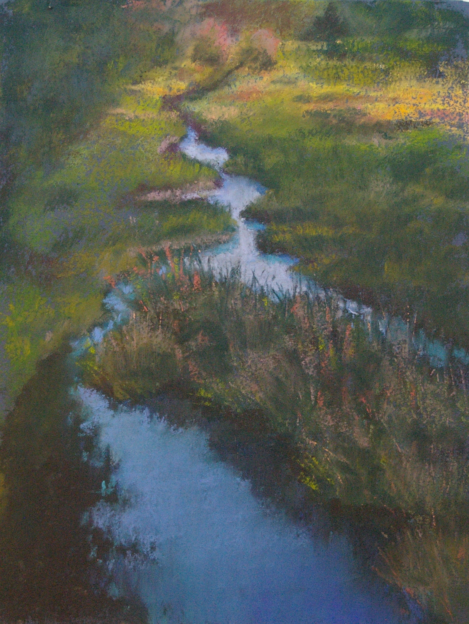
I recently ordered a package of eight large (24" x 36") pastelbords from Above Ground Art Supplies in Toronto (ordered by phone, they arrived on my doorstep by special post, but took several months--I had been warned by the clerk that this could be the case, and I wasn't in a hurry, so that was ok).  The package of eight, ready-to-paint boards was around $250, delivered. I wanted to try painting LARGE, and was frustrated by having to cope with the persistent curling of Wallis paper purchased in rolls (I could have it dry mounted, but that would require an extra, off site step and pre-planning!). PastelBord, a relatively new product, is hardboard coated with a special mix of kaolin clay and marble dust--heavy, but sturdy. I painted my first piece on the full-size sheet, and was very pleased with the drama of the resulting painting. Because of its size (the biggest I've done yet in pastel) and its subject matter, I called it Breathtaking.

Breathtaking
Breathtaking

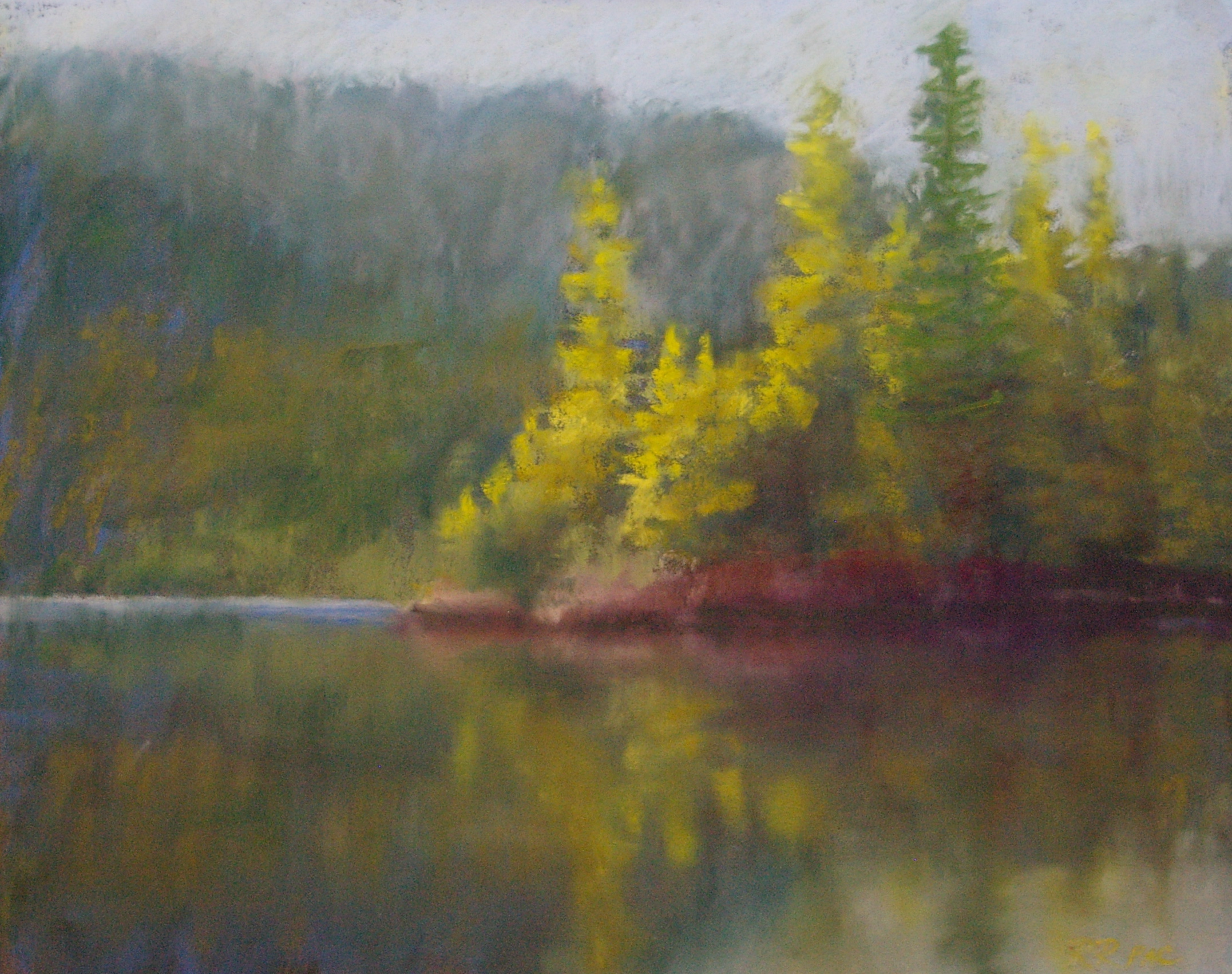
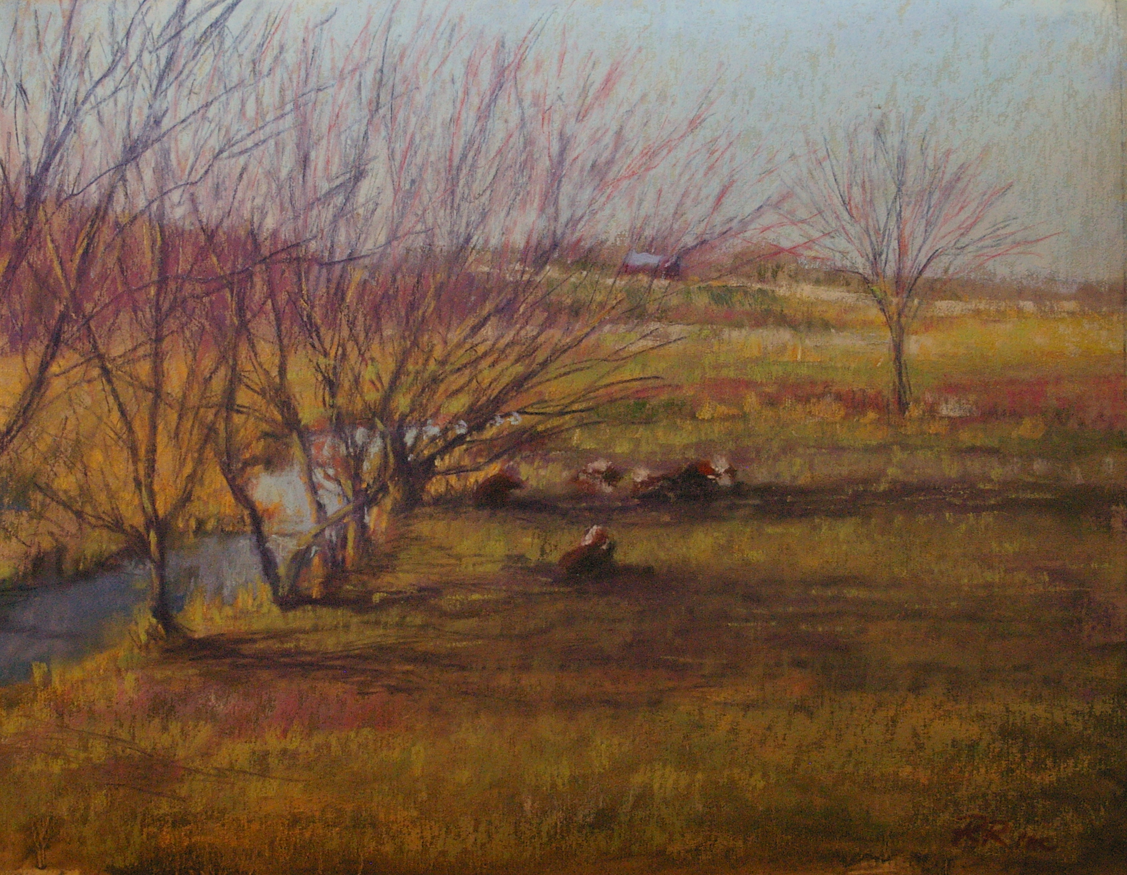
Next, I asked my husband to cut a board in half horizontally on his tablesaw, and experimented with two strongly horizontal paintings.  The second one kept me up until 2 a.m., struggling with achieving a needed depth of field, but that was because of the subject source (a photo with an extremely shallow scene), not the pastelbord. Again, I was very happy (eventually) with the result.  I think I'll keep using this support--but now I have to save up for the framing of these large works!

Time To Go
Time To Go
Winter Hedgerow
Winter Hedgerow

Go West, young woman!

Ok, so I'm not so young, but it just doesn't sound right to say "Go west, middle aged woman!" Anyway, I've just returned from a two-week stay at a lovely house on the Sunshine Coast, just north of Vancouver.  In an attempt to escape Ontario's bleak January weather, we fled to B.C.'s warmer, albeit much wetter clime.  We did have quite a few days of sunshine (that being why we chose the "sunshine coast" location), but even when it was raining, it was warmer, and the fresh scenery inspired my painting. I took along a handful of previously unused photo references, and my laptop in order to take advantage of the local photos I took while there.  Here are some of the results (see the pastel gallery for many more new images).


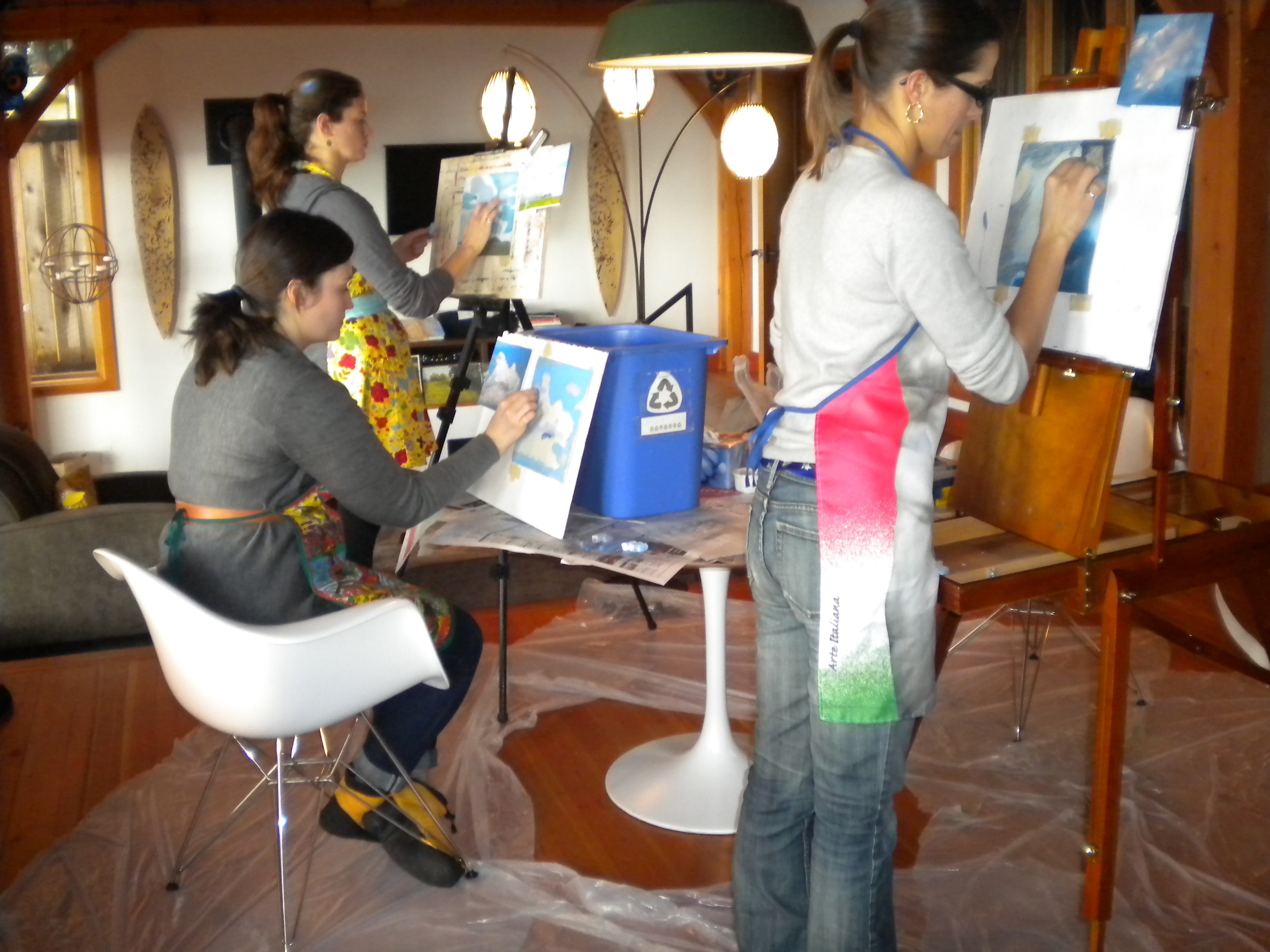
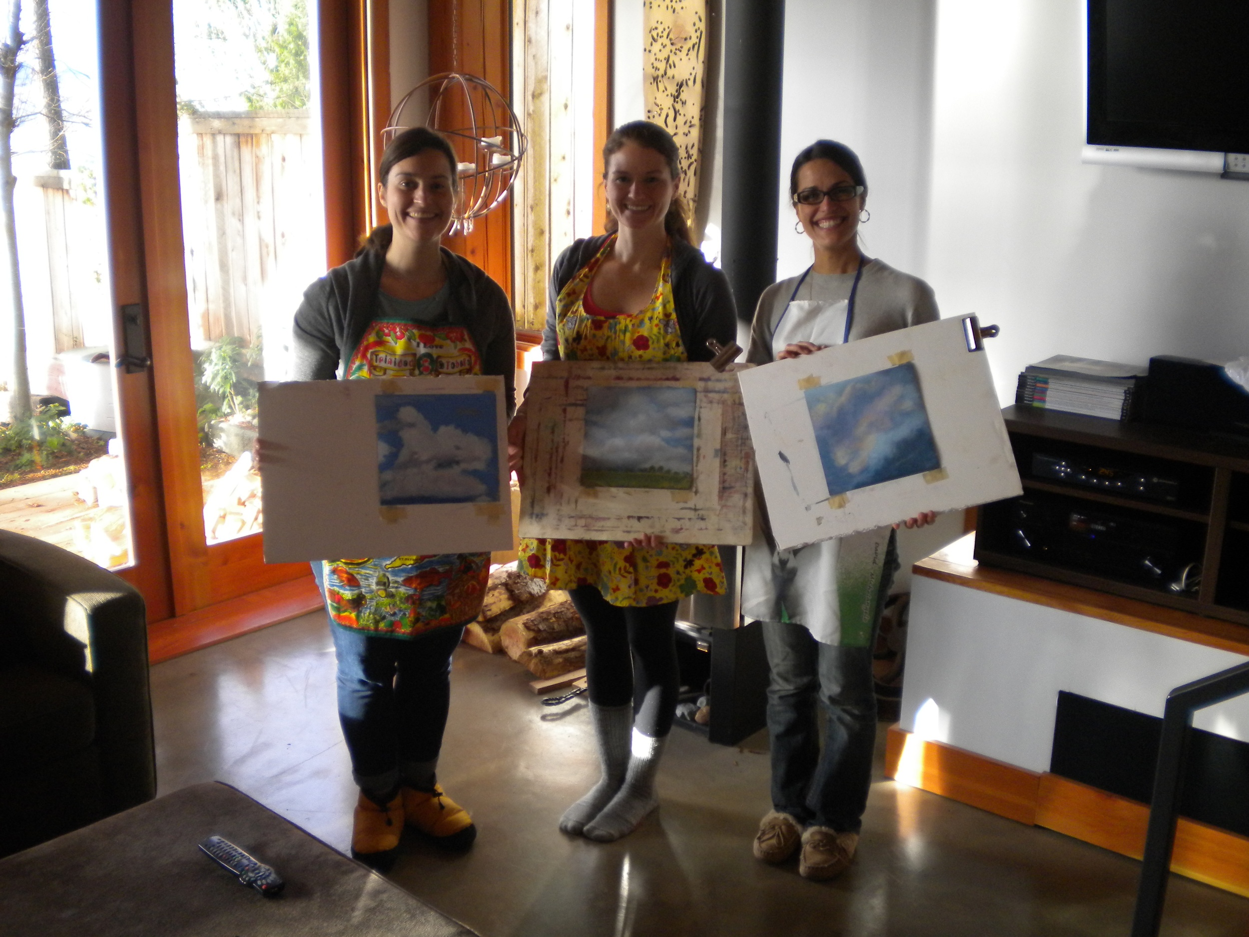
Also while there, I taught an intro to pastel session for my daughter-in-law and two of her friends.  We had a fun day together, and the budding artists were pretty pleased with their resulting works!


Painting Winter

Early in December, five students gathered to tackle the painting of winter snow scenes. I think they were pleasantly surprised to discover that it's easier than they thought! Here are some of the key ideas from the lesson:

  • Snow scenes work best with fewer layers of pastel, to allow texture of underpainting to show through, adding realism
  • Be clear about your composition—try out thumbnails to select the best pattern and shape
  • Do a value study to work out pattern of darks and lights before you begin
  • Design the pattern of darks: most snow scenes are primarily light with a little dark—use the darks to direct the viewer’s eye path
  • Underpaint in blues and purples under deep snow; in warm ochres, siennas, browns where brush or grasses will peek through the snow
  • Create a strong abstract pattern
  • Snow in shadow is warm blue or purple
  • Snow in sunlight is often warm white or cream
  • Add pale pinks, yellows, turquoise, lavenders for variety
  • Layer heaviest pastel where the snow is deep, in sunlight—an opaque layer will stand out from the other, thinner areas
  • Where sun and shadow meet, add a thin line of turquoise between the blue and white, and blend gently for added glow
  • When painting light snow or hoarfrost, let the dark/warm underpainting do the work of creating texture
    • Glaze pale pastel (white, pale tints) gently, and preferably ONCE over the underpainting
    • Use your strokes to indicate upright weeds, grasses; use snow colours to cut into dark to create stalks etc.
    • Use edge of dark colours back into the white to create more texture or refine shapes
    • Add warmth with willows, poplars, dogwoods, corn stubble etc.; completely “cold” paintings are seldom appealing!

And here are the steps in the demo painting I discussed, Thin Ice:

McLaughlin Gallery workshops

Recently the Robert McLaughlin Gallery in Oshawa mounted a wonderful exhibition featuring the work of William Brymner and some of his students, including Clarence Gagnon and Maurice Cullen. Although a Scot, Brymner visited and painted in Canada frequently, and his influence on early Impressionist-era painters in Ontario and Quebec was significant. The exhibition includes both luminous landscapes and tender portraits, and is very inspiring to contemporary realists. I was lucky enough to be invited by Program Director Joel Campbell to teach a series of two workshops related to the exhibition.  The first session, scheduled to precede mine, was to have been a lecture by an art historian, who unfortunately got caught up in Toronto traffic and didn't manage to get to the Gallery to make her presentation!  Nevertheless, a week later I faced 12 eager students who, despite not having had the benefit of the contextual lecture, were keen to learn the lessons available from Brymner's work by emulating the paintings in the exhibition.

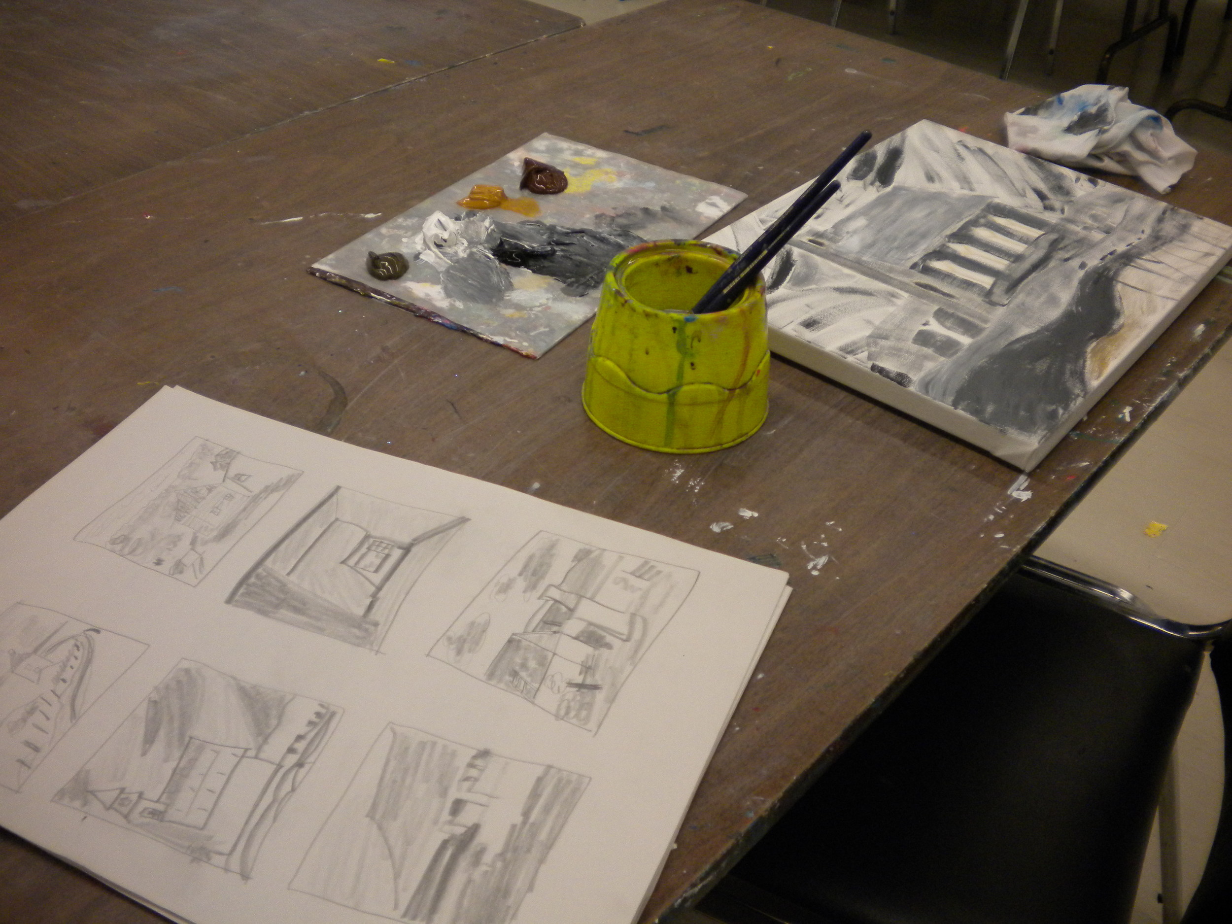
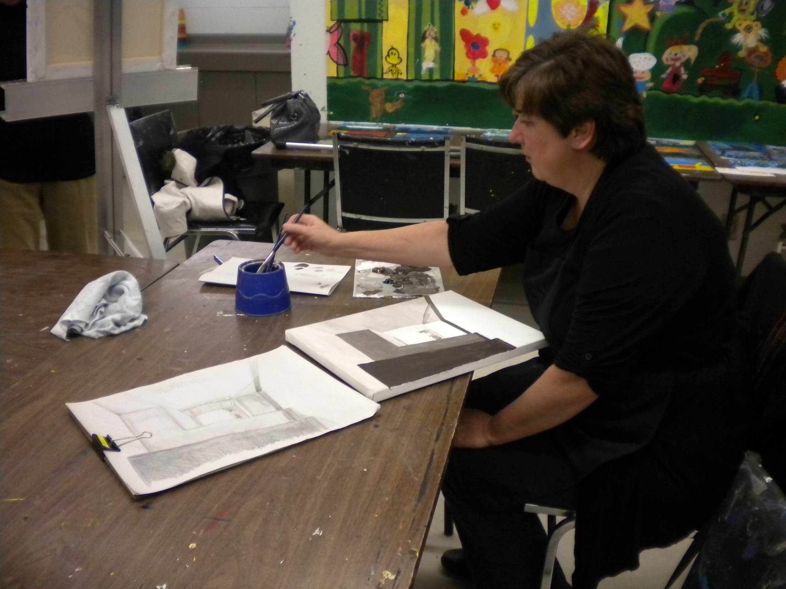
Because Brymner's work bridges the Academic and the  Impressionist styles and techniques, I began with a very brief introduction to these two approaches, accompanied by a few slides of each.  Quickly, however, I moved on to a discussion of values, emphasizing the role of the value structure in the compositions.  The students then worked in the exhibition with paper and charcoal or pencil to create ten quick value thumbnail sketches based on the works in the show.  Choosing their favourite of the ten, they then re-created the value study in more detail, scaling it to the canvas they'd be painting on in week two, and also completed a contour drawing of the main shapes in the work. A few students managed to also complete a value underpainting ( a "grisaille") on their canvases within the all-too-brief two hour first session.

The following week, having transferred their contour drawings to their canvases, and completed the underpainting in tones of sepia or gray, the students added acrylic colours to emulate those used in the original.  In order to do this, they had to view the work again in the main floor gallery, make detailed notes about the colours used, then come back downstairs to the studio and paint from their memories and notes.  It was a great exercise for the eye, brain, and hand!

Although none of the students really completed their paintings, they had a great start and the reference notes needed to complete the works at home.  As well, they had experienced the exhibition at a level much beyond that of the casual viewer by studying one work deeply.

The Gallery and the students seemed well-pleased by the experience, but I think we'll schedule three painting classes if we take this approach again!

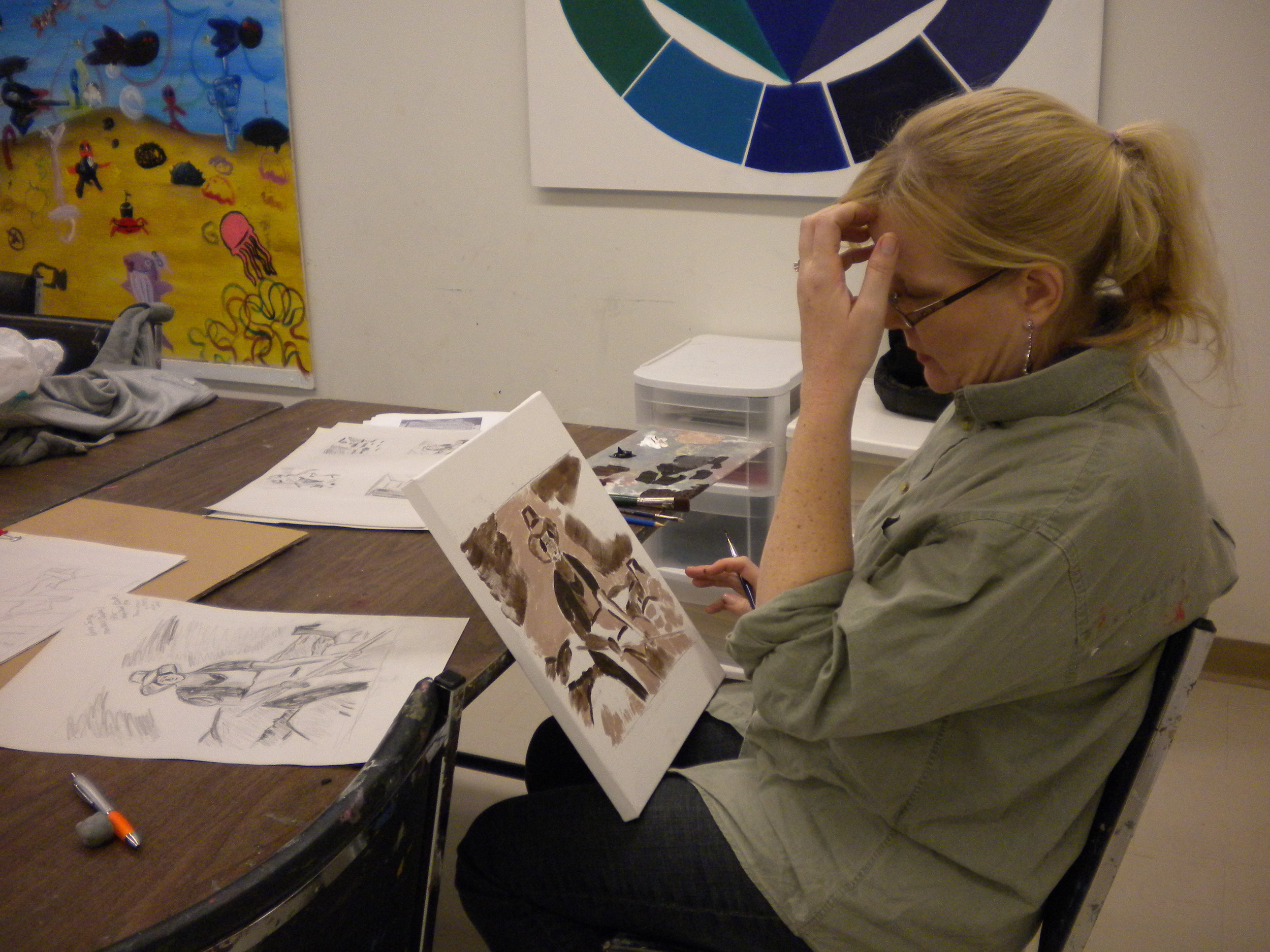
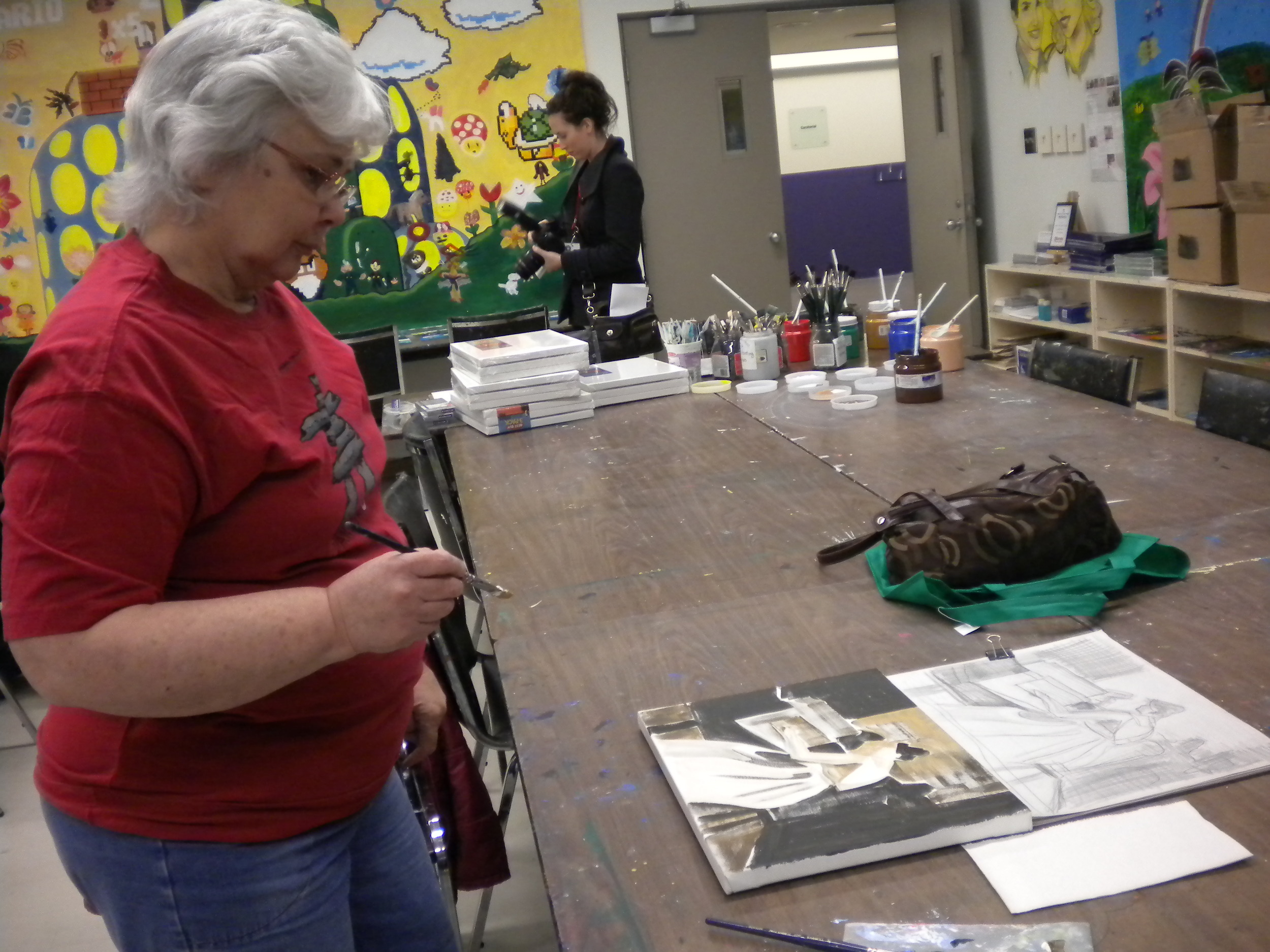
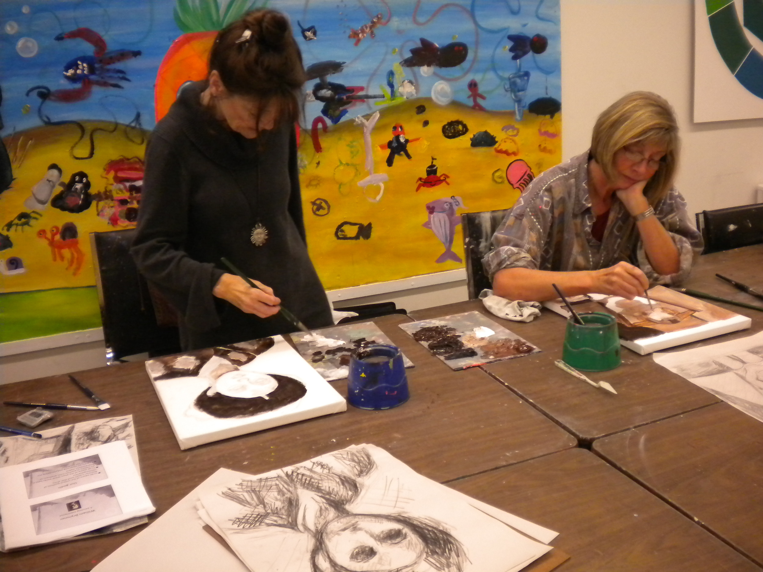
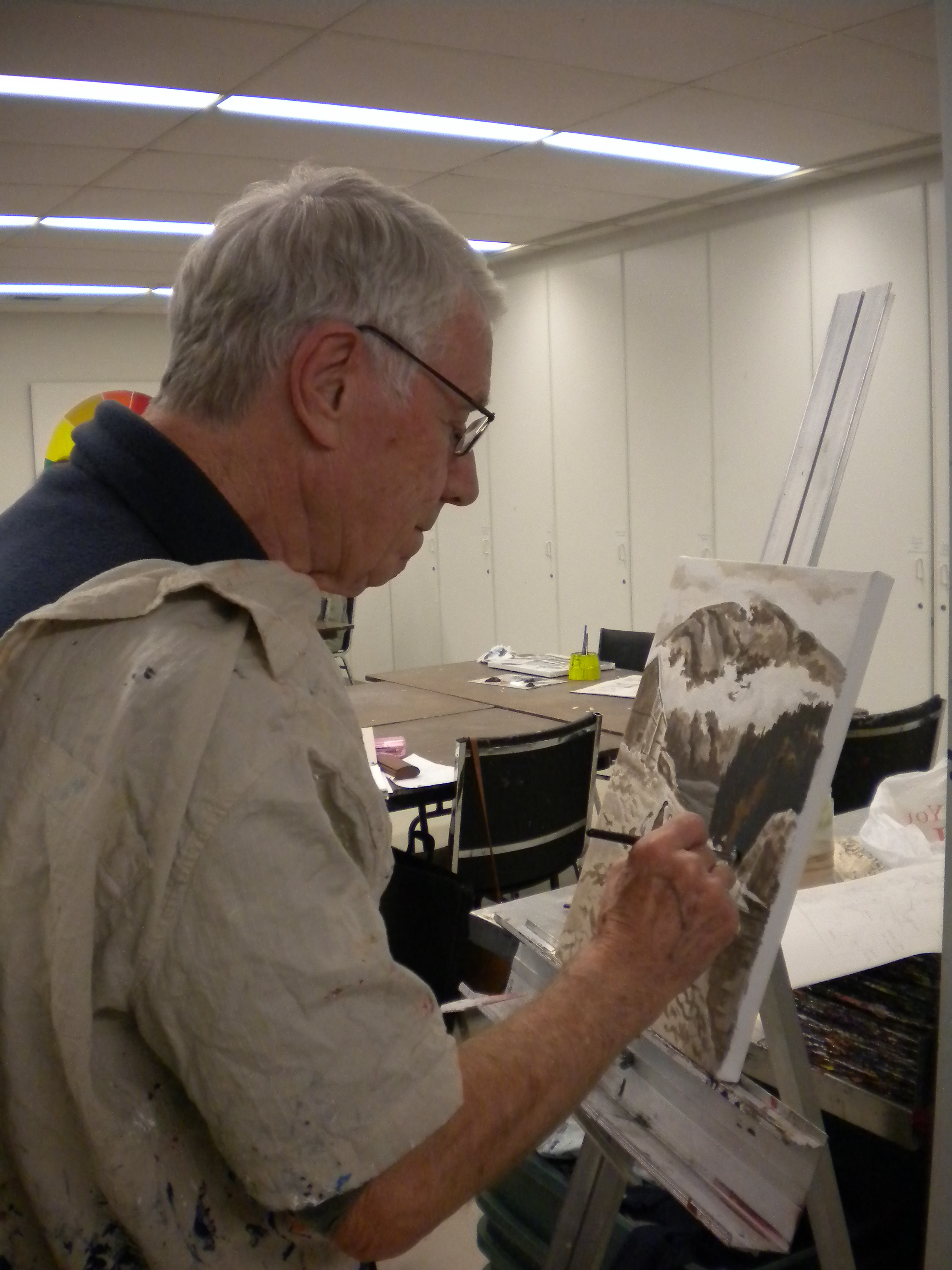
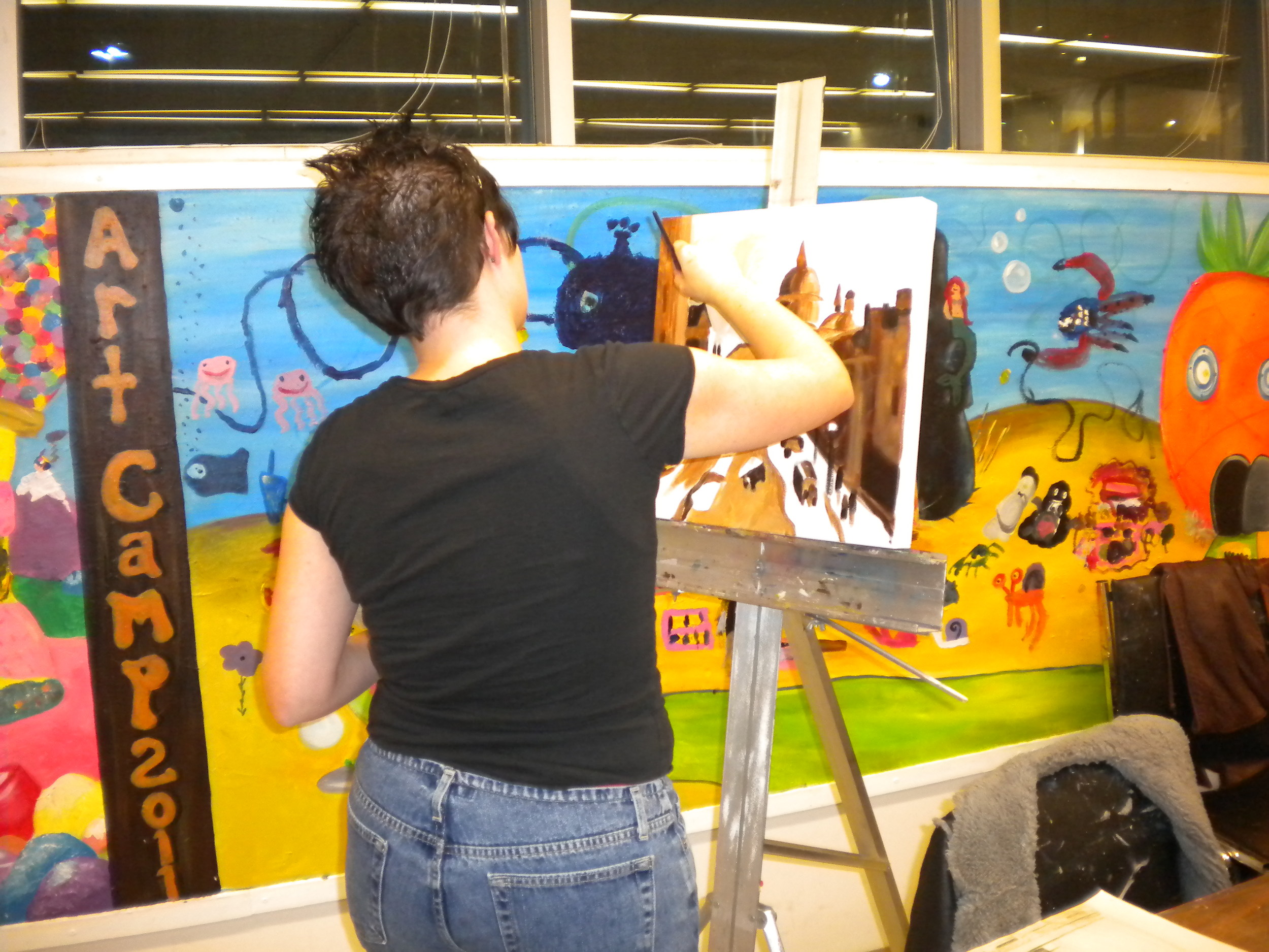
Here are some photos of works in progress:

Using neutrals

Yesterday three students and I enjoyed a session together exploring the power of neutrals. These subtle tones are often neglected by the new pastelist seduced by the jewel-bright intensity of pastels, but they are critical to the success of paintings that aspire to be naturalistic. Nature is sparing with her intense hues, and when we paint with only these, the results can be garish and very unnatural. Neutrals are of great use when utilizing the visual principle of "simultaneous contrast" to direct your viewer's eye through your painting.  This principle, at bottom, tells us that things are influenced by their contexts.  In other words, our perception of a colour's hue, value, temperature, and intensity are all affected by what surrounds it.  There are startling examples in art books where the very same colour looks entirely different because it is surrounded by different colours. For example, a "cool" blue can look warm if surrounded by even cooler greens, or a "warm" scarlet can look cool if surrounded by even hotter oranges. In the same way, a bright colour shouts even louder when surrounded by grayed, subdued tones. You can use these effects to emphasize your focal point and de-emphasize less important areas of your painting. These tones are the quiet cousins of your palette box, and as such are easy to overlook.  Richard McKinley suggests organizing them in a separate section of your pastel box, where their subtle beauty and quiet appeal will be more apparent, rather than leaving them to fight it out in the company of the more brilliant hues.

To understand this concept, first we examined photos that revealed the power of neutrals to provide a foil for notes of bold colour.  Several photo spreads in the November 2011  issue of National Geographic provided perfect examples: one shows a woman wearing a red headscarf striding through a burnt-out forest in Uganda; the other features a spray of crimson maple leaves on a rock in the midst of a cold scene of a rushing river in late fall. In both cases, the small notes of red leaped off the page and riveted the eye. We also looked at a variety of paintings in art books that illustrated the same idea, even critiquing one in which two notes of red-orange in an otherwise gray-toned painting bounced the viewer's eye between the two extreme edges and destroyed the concept of the work!

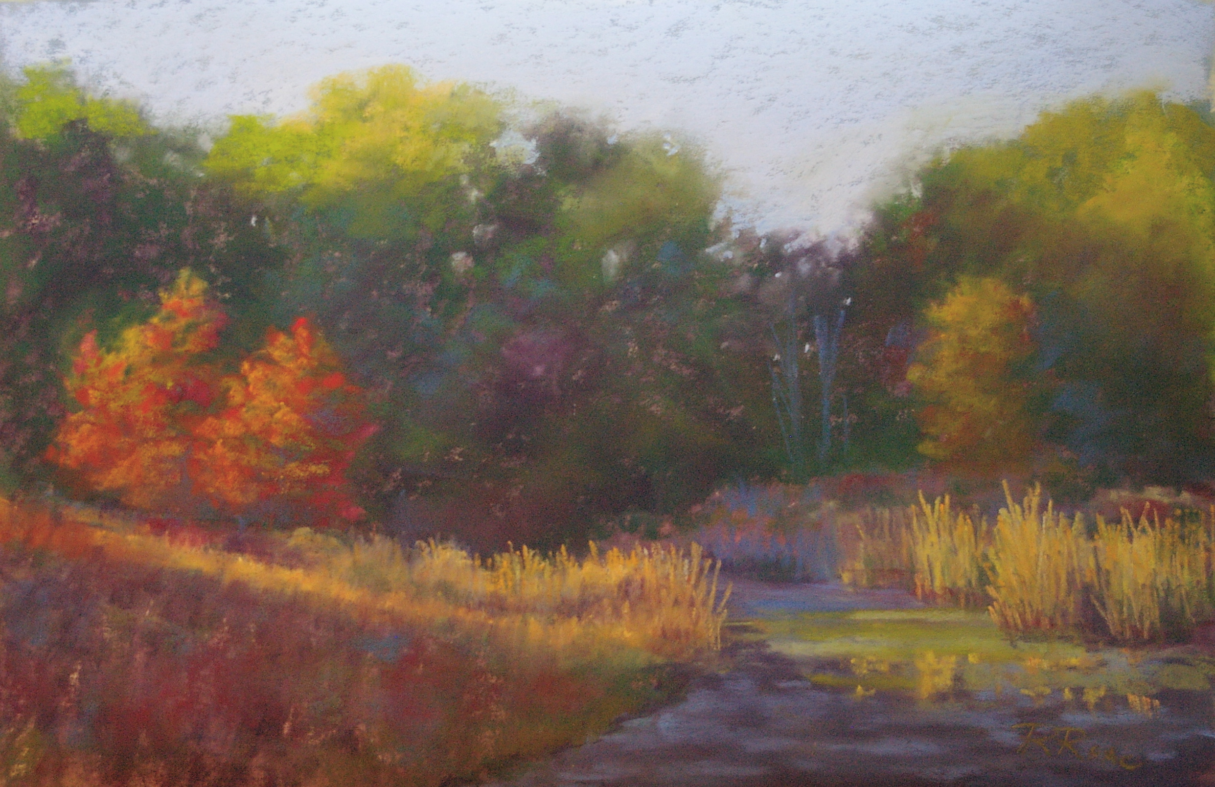
We each chose scenes in which we could use the neutrals in the majority of the work, adding a contrastingly intense hue in the area of our focal point. The choices included a snowy field in winter, lit by a splash of warm sunlight on remaining corn stubble in one area only; a shaded green field in midsummer, with a streak of bright green light slipping behind the trees in the foreground and lighting up a slice of the field; a subtle, foggy scene to which the artist added a note of lime green to indicate a momentary ray of light on a distant meadow; and my choice, a photo I had taken just that morning, of the frost on the marsh behind my house, kissed by the first ray of the rising sun. Here's the resulting painting, though it seemed to be impossible to render the correct colours digitally (the actual painting has much less intensity in the orange tress, so the focus is more on the light on the marshes!):

It was a challenging lesson, but all the paintings turned out very well, and it's a concept that is a very useful tool in the painter's toolkit.