Performing "tree-age"

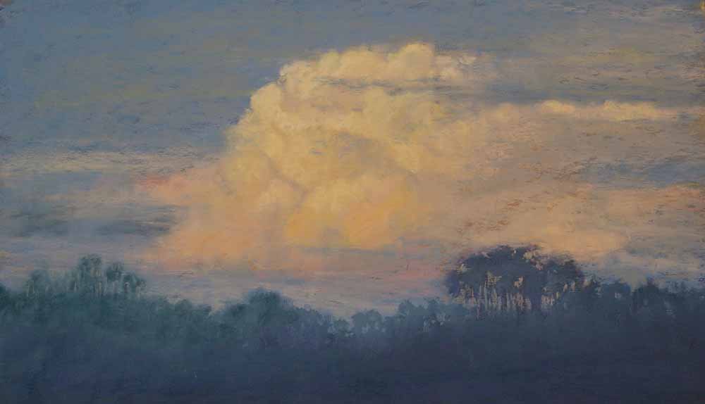
As in "triage," a process of prioritizing patients based on the severity of their condition--but on a tree in a painting! Last night I started on a pastel painting (17.5" x 11.5") inspired by a beautiful moment I experienced early Monday morning, as I was making my weekly commute back to the city from our home in the country.  As I reached the end of our gravel road and cleared a band of trees, I gasped to see the gorgeous scene spread out beside me.  The morning sun was at that fleeting state where it has not yet cleared the horizon, but is sending up shafts of colour ahead of itself, painting the sky with tender pinks and peaches.  Lovely--but what made it special was the water in the deep ditch beside the road, a result of the weekend's torrential rainstorms, that was reflecting the glow in a ribbon of light against the dark grass verge. Happily, I had my camera in the car and was able to grab a handful of shots before the sun rose and changed the effect completely--besides, I really had to go on to work, much as I would have liked to stay and watch the whole show unfold. So, here is the roughed in first phase of the painting, and the results of the alcohol wash I usually do to "melt" the pastel into the paper's surface.  As you can see, this results in a pretty strong dark pattern for the foreground tree and grass panels.  I liked the abstract shapes, so went on to the next stages, adding layers of more subtle colour and value to shape the scene.

phase-1wash-phase

It was going along well, but increasingly the tree silhouette was bugging me--it seemed too strong a contrast, and kept drawing my eye away from the water reflection and the distant dawn where I wanted the focus to be.  What to do?  Pastel is a very opaque medium, and I always tell my students: "There's nothing you can do that can't be fixed." However, this time I found the limits of that statement!  After brushing off the dark pastel as best I could (carefully, using a small stiff brush and catching the dust on a paper towel below), I simply used a light yellow pastel to cover the spot, and wet it again with alcohol.  Uh-oh--the tree ghosted through pretty strongly!  I guess it was because I laid in the underpainting with a very deep, rich purple pigment with lots of staining power. So I had two choices--put the tree back in  or find a better way to cover it up.  After some thought, I decided I really liked the painting better without that tree, so onward...

with-tree

tree-out

I took a deep breath and washed the whole sky again with alcohol, brushing out the tree shape fairly vigorously. Looking better, especially after I dried it with my hairdryer--I was anxious to see if it had worked.

sky-out

After that, things went more smoothly.  The sky was reworked, and I moved the painting to finish, and titled it Indrawn Breath to represent both the hush of the moment pictured, and the deep respirations involved in its execution!

indrawn-breath-web

A large, a small, and two mediums!

When you find a scene that really inspires you, sometimes it's fun to try it several times, in different sizes and media. Lately I've been wanting to focus on developing my acrylic painting skills, especially larger format canvases, so I recently completed a painting based on a photo I took in Massachusetts early last fall.  My daughter, granddaughter and I took a trip to the Clark Institute in Massachusetts to view a fabulous exhibition (Like Breath on Glass: Whistler, Inness and the Art of Painting Softly), showcasing tonalist painters of the late 19th c.. The exhibition was wonderful and inspired me greatly--well worth the long trip there. The following morning, we were driving down the long steep driveway from the B & B where we'd spent the night, and I suddenly spotted a shaft of sunlight illuminating a large tree that was just turning golden yellow, in the midst of other foliage that was still primarily green.  Of course I had to slam on the brakes (causing consternation to my passengers!) and get a few photos. I mulled over that image all the way home, and found time to interpret it in acrylic just before the end of the year. Here it is; the original (30" x 24") is now at Davis Canadian Arts in Stratford Ontario (see the Sales tab for contact info).

autumns-progress-web

This past month, I was teaching a weekend pastel class in Port Perry (see Workshops tab for some photos--the students did awesome work!), and decided to do a small pastel--I sometimes work at a small painting in order to give the students some breathing space, especially if it's a small class--otherwise they may feel just a bit TOO closely monitored and get tense.  The tree photo was in the pile of photos I bring along for students to use for practice, and I was inspired anew.  I got a good start on the piece that afternoon, and did a little tweaking back in the studio.  Here it is--a small (9" x 6") but mighty work!

tranquil-path-web

So, which do I prefer?  Hmmm--I think they each have merit, but a completely different "feel."  Obviously the larger work is more detailed and more "realistic" as a result, and I'm very happy with how it turned out.  However, the small pastel captures the evanescent moment perhaps better, and has a softer, more dynamic feel. It was interesting to try to capture essentially the same scene in a much smaller format, with a different medium.  Coincidentally, today's twice-weekly e-letter from artist Robert Genn speaks to exactly this process of evolving a work in different sizes and media.  If you aren't familiar with Genn's newsletter, check it out here: http://painterskeys.com/.  It's a terrific inspiration that arrives in your email twice a week, and it does NOT lead to unsolicited spam messages.

This smaller painting will be in the Pastel Artists Canada (PAC) members' show in late May-mid June at Todmorden Mills in the Don Valley east of Toronto. For more information on the show, visit www.pastelartists.ca.

All in the details

A small painting I was doing recently was ok in terms of composition, and I liked the basic concept, but it just didn't have any "life". I mused over it at this stage for several days...

morning-field-11

Then, on the weekend I happened to drive past the site where I took the original photo. The difference now was that the light of early morning was streaming through the trees alongside the field--and suddenly I knew what was wrong with the painting--it needed a clearer light source! See how much better it looks with that added...

morning-field-21

Later that same week, I prepared several underpaintings using a thin wash of oil paint, a technique learned from Richard McKinley at a workshop last October. I used Turpenoid, a non-toxic turpentine substitute, to thin the oil paints to almost watercolour consistency before blocking in the big shapes and colours for three paintings.

underpainting11

undrpainting21

I had watched Richard use this technique in a demo, and after about ten minutes, with a little help from a hairdryer, the oil washes were dry enough to start adding pastel on top. So, why weren't mine drying?? I waited, and waited, and WAITED. Even the next day, the paper surface was still greasy and moist. Hmmm... Eventually the larger piece dried enough that I could complete a pastel painting on top, with some struggle to get the lighter colours to show. The pastel kept "melting" into the oil wash--what on earth had I done wrong? I abandoned the other two underpaintings until I could figure out the problem...

summerbright1

Finally I went back to the notes I took at Richard's workshop--and found the answer! He told us (and I even wrote it down but obviously didn't commit it to memory) that the BLUE can of Turpenoid is what you want--the green can (you guessed it, that's what I have) is unsuitable for this technique. Uh-huh. I don't know what the actual chemical difference is between the two, but you can bet I'll be donating my green can to my husband's shop and seeking out a blue can for pastel underpainting in future!

However, the other two underpaintings did EVENTUALLY dry--and here are the finished pastel paintings.

aspenwood1garden-in-the-foothills1

Painting a commissioned piece

When our good friend Michael came for dinner recently, he brought a special present: a bound custom "Mac Book" of photos of his recent trip to New Zealand with my husband.  It is filled with special memories of this time together, and we'll treasure it.  However, Michael also asked me to paint him a pastel of one of the photos, as a commission piece. I usually don't paint from anyone else's photos--we all know that photos, however good, can't capture the subtleties and experience of actually being on site, and though I work from my own photos all the time, that interpretation is influenced by my memories of being at the actual place.  In this case, however, I have visited the site where Michael took the photo, and was able to conjure up a vivid memory of the majesty and exhilarating feeling of breadth he captured in his photo on the Canterbury Plains of the South Island of New Zealand. So, I agreed to give it a try, and thought it might be fun to capture the stages of the development of the painting here.

First, I drew what is called a "thumbnail" or "notan" sketch of the scene, based on Michael's photo.  This step helps me to analyze the value structure of the painting, to ensure a pleasing balance of light, dark, and middle values.  It's sometimes said that the most memorable paintings are either a lot of dark and a little light, or vice versa.  In this case,  the scene was pretty much split between very light and quite dark values--I'll probably have to adjust the darks and the highlights to get some movement through the painting. As well, I am going to have to adjust the band of blue Echium flowers in the foreground--beautiful as they are (and Michael's a horticulturist, so I know they're important to him), they form a somewhat impenetrable band across the whole of the scene, stopping the viewer's eye from travelling smoothly back to the magnificent mountains. I'd have to think of some way to integrate the two, and prevent the effect of discrete bands across the width of the painting. As you can see in the sketch, I'm considering inserting a pathway through the foreground flowers.

imgp7931

Once I was satisfied that I understood the structure of the painting and knew what I was going to have to adjust, I drew the big shapes of the scene onto a large sheet of Art Spectrum ColourFix paper, a sanded pastel paper I use frequently. Next, I used semi-soft Girault pastels to scribble in some colour into these big shapes, selecting the colours by temperature (warm or cool) and basic local colour (the "ground" or most common colour in that shape).  In the sky, although it would end up being a very cool blue/grey, I chose a warm peach, to provide a glow from underneath the eventual sky colour.

imgp79322

Next, I used rubbing alcohol and a big brush to brush down the shapes, working from lightest to darkest and cleaning the brush in between colours.  I was very loose, allowing the alcohol to drip and run to a certain extent--serendipitous texture often works to your advantage in a large pastel, and I could always cover up anything I didn't end up liking. Here's this step, looking pretty abstract and bold--those blues really jump out, don't they?  They're going to need some subduing, for sure!

imgp79331

Starting with the sky, I began adding more pastel, this time seeking colours closer to what I wanted for each final piece.  Each shape (other than the sky) was broken down into smaller shapes to begin to build the darker and lighter sections, which, of course, is how we build three-dimensional form on a two-dimensional surface.  The mountains and foothills began to emerge!

imgp79341

I kept working, adding detail and more colours to each area, and developing detail in the foreground.  The planned pathway has narrowed to a mere gap in the foreground band of flowers--it divided the picture into quarters when I tried it, and was just distracting.

imgp79361

I wasn't feeling good about the balance of the picture--there was just too much foreground.  Here I tried blocking some of that foreground with a piece of paper to try out various ideas...yes, I think that's better, so I cut off a strip about 2" wide from the bottom of the paper.

imgp79371

Finally I decided I wanted to emphasize the contrast of the light and dark areas suggested in the mountains, so I carried the idea down into the middle ground field, and adjusted the colours in the sky a bit too, grading the left side with a bit of peach, and the right with some grey-blue, to suggest a cloud outside the picture plane casting a shadow on the scene.  I also spent more time detailing the foreground to add a sense that this band of flowers is right in front of your feet.  I am now satisfied that I've captured the feeling of the place and created a painting that has a sense of atmosphere and movement.  Band of Blue is complete! I'll leave it to Michael to decide how to frame it.

imgp79381

Introducing Ruth Rodgers' artist website

Welcome everyone!  I am happy to announce the launch of this website, the result of three years of growth towards a viable artistic career. I am most grateful to the Pastel Artists Canada (www.pastelartists.ca) site for hosting my images for the past three years, and will continue to have some kind of web presence there, but the time has come to expand--so here we are!  I hope that friends, students, and collectors will enjoy staying updated on my work via this site, which includes galleries of works in pastel and acrylic, workshop and exhibition news, and blog entries about my artistic process. While my work is available in various galleries in Ontario (see the Sales tab), you can also contact me regarding direct sales from this website (also see the Sales tab). Thanks to Creative Creature (www.creativecreature.ca) for the site design! I work in soft pastels, acrylics, and oils. My style is best described as ‘naturalism’ which seeks to represent reality not in the hyper-realistic way of photographic realism, but in the way that the human eye and brain actually perceive the world. Thus, areas outside the main focal point may be soft-edged and indistinct, just as they are in our peripheral vision. I am influenced, as well, by the effects of light so well conveyed by the masters of Impressionism. I have studied with a number of Canadian and American pastel artists, and hope to have integrated their teachings into my own distinctive style.

I am also inspired by my immediate surroundings, and hope that my work will help viewers to see the beauty in the everyday world. A country girl since age 13, I focus mostly on the rural landscapes and rhythms of agricultural life in the counties encircling London, Ontario, with occasional trips to exotic locations. I am especially interested in the changeful skies over southwestern Ontario, and frequently depict them, in all their moods, in my work. I also enjoy interpreting the human journey through figural works.

I am a member of the Pastel Artists Canada, and highly recommend this group for pastel artists at any stage in their careers.

The image below is my current "signature" image--titled Castles in the Air. It was an award winner in the 2008 PAC juried show, and represents my dreams of transitioning to a full time painting career over the next few years.  It's also the only work my very supportive husband has ever asked me not to sell--it will stay in our own permanent collection. Enjoy it and the rest of the site!  Feedback is welcomed via comments on posts or email at rodgers.ruth@gmail.com.  Thanks for visiting--come back soon!