I am happy to announce that I will be leading a 7-day painting workshop from April 1-7, 2019 in France's gorgeous Lot Valley (just north of Toulouse) at the beautiful Domaine du Haut Baran. This updated French chateau is run by William and Rosalie Haas, accomplished hosts who will take care of every detail and will transport us to many great painting locations in the area. This location has been the setting for dozens of highly-acclaimed painting workshop experiences with well-recognized artists. See their website for details about the site (http://www.hautbaran.com/).
The fee of $3000 US includes workshop tuition, double occupancy accommodation in luxuriously-appointed rooms, transportation to and from the airport and throughout the week, and most meals, prepared by accomplished chef Rosalie. The spring timing will mean cooler temperatures and fewer tourists, for a unique and enjoyable experience.
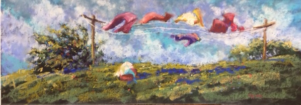
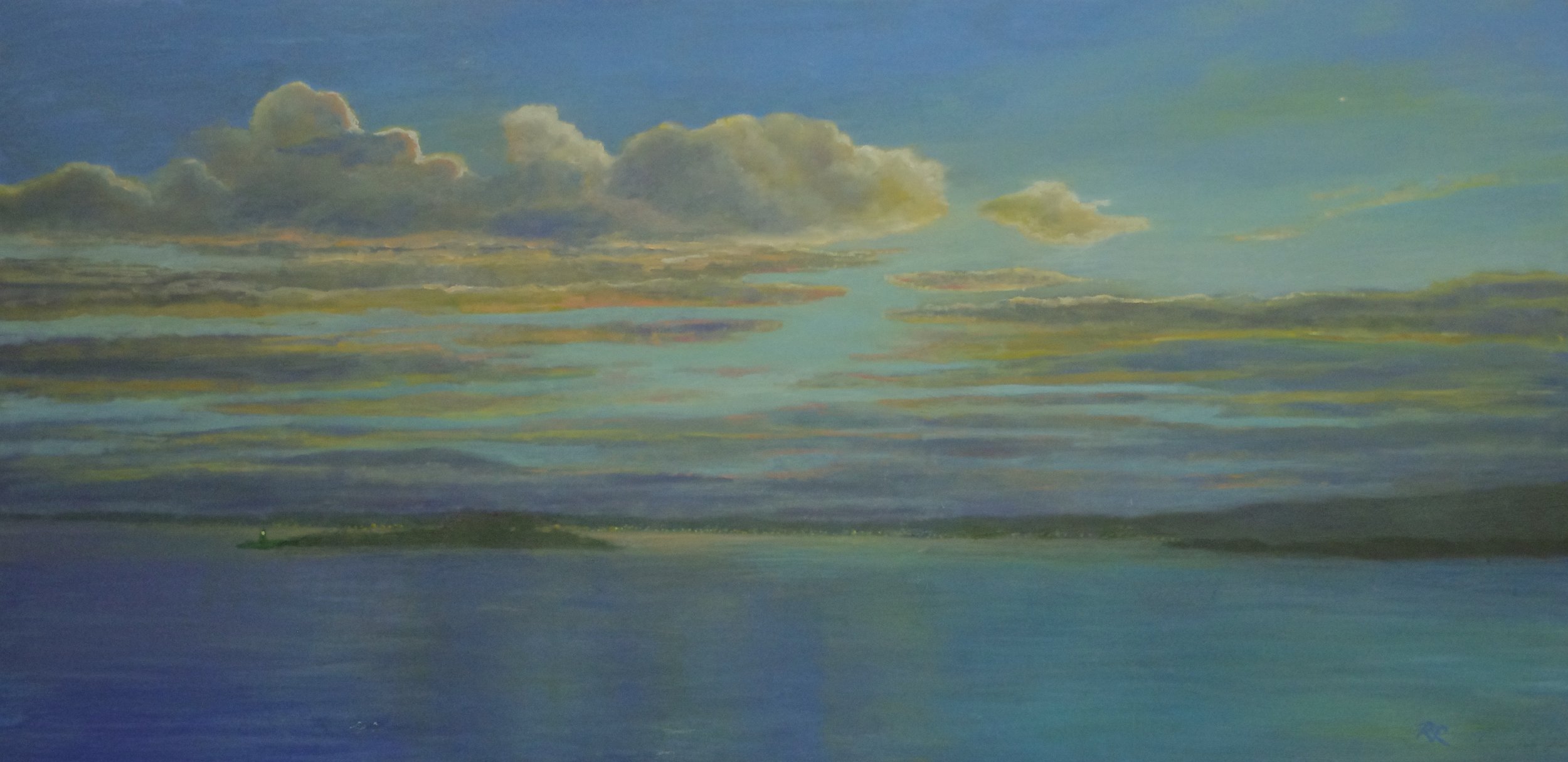
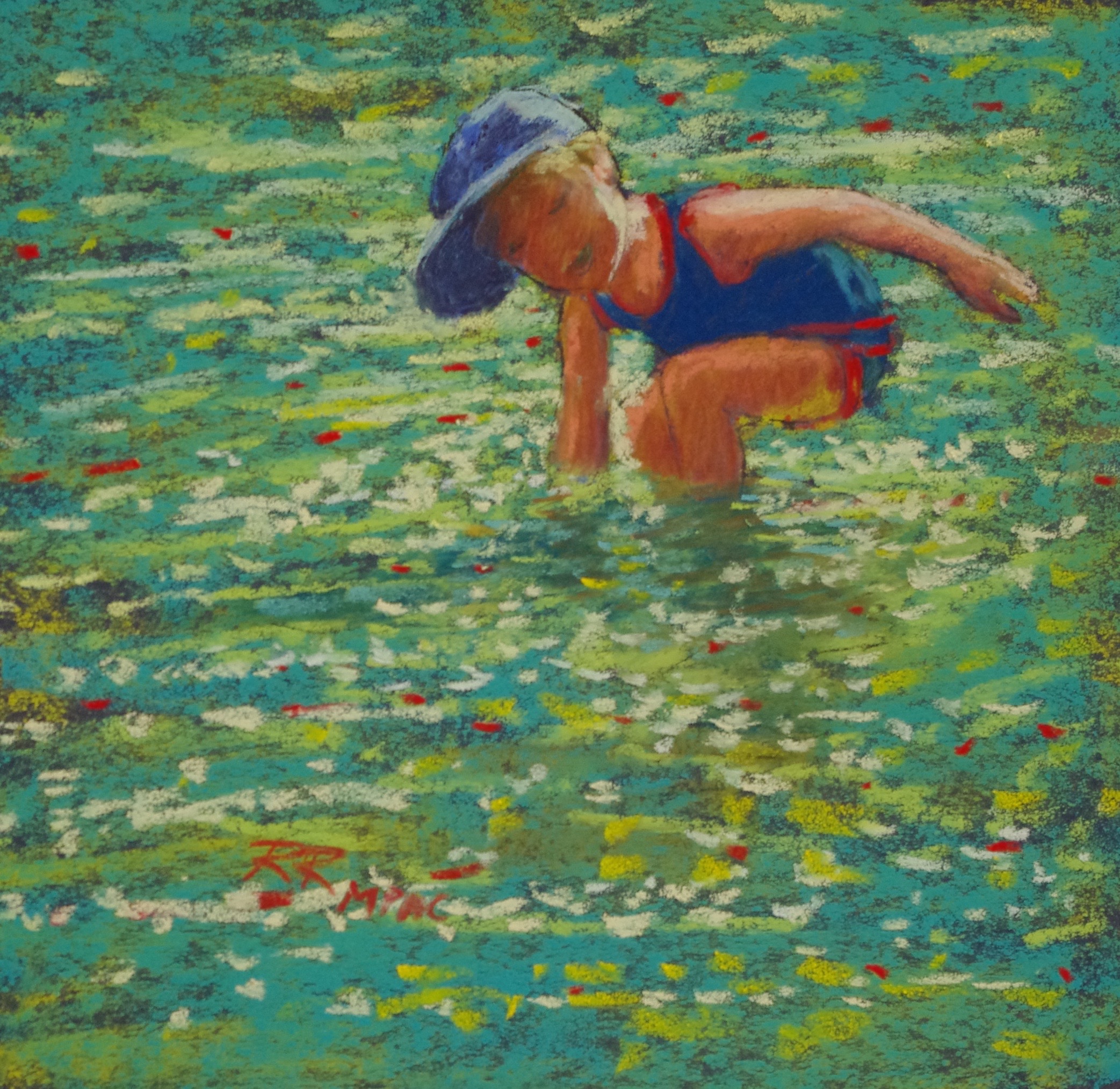
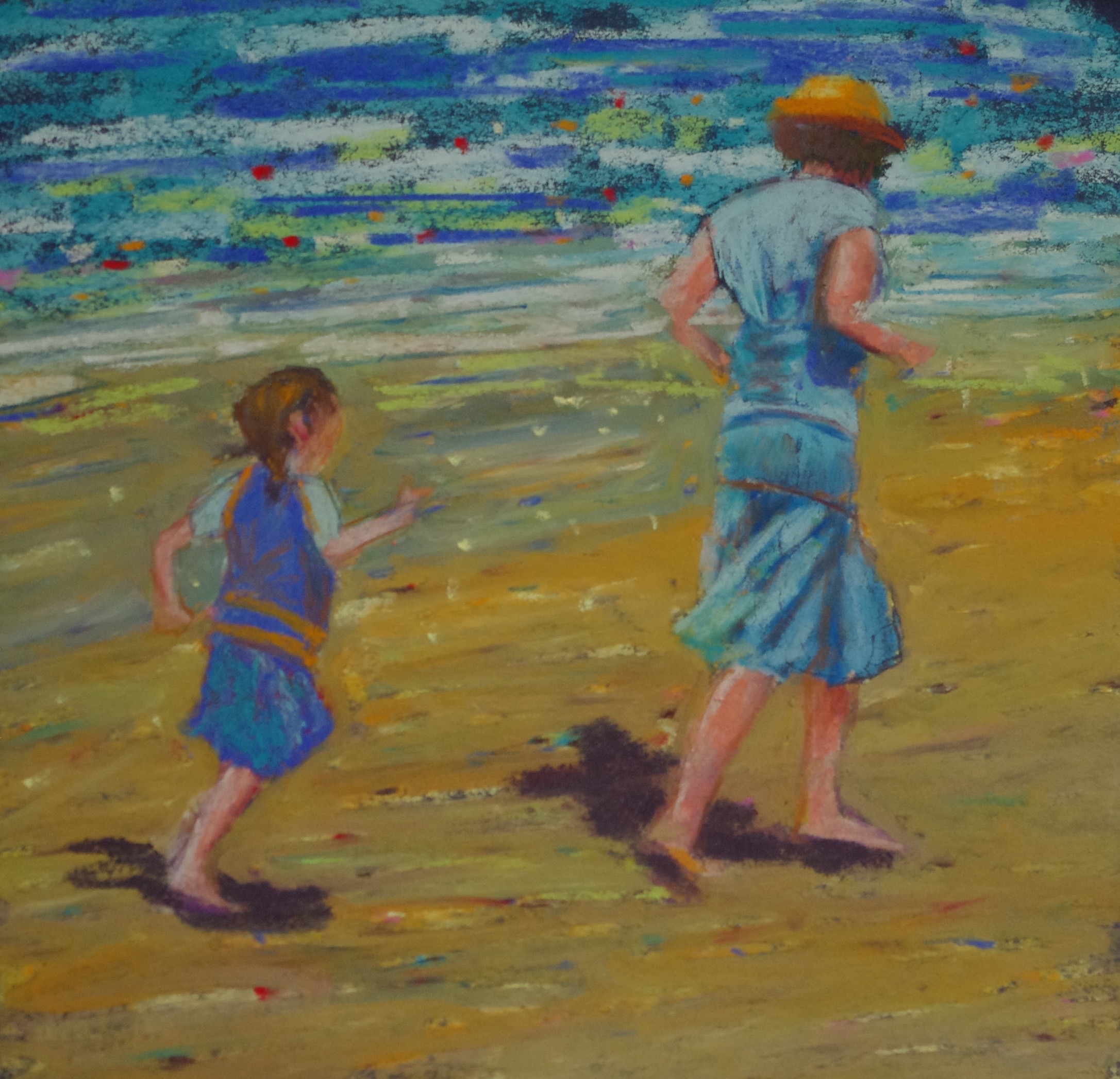
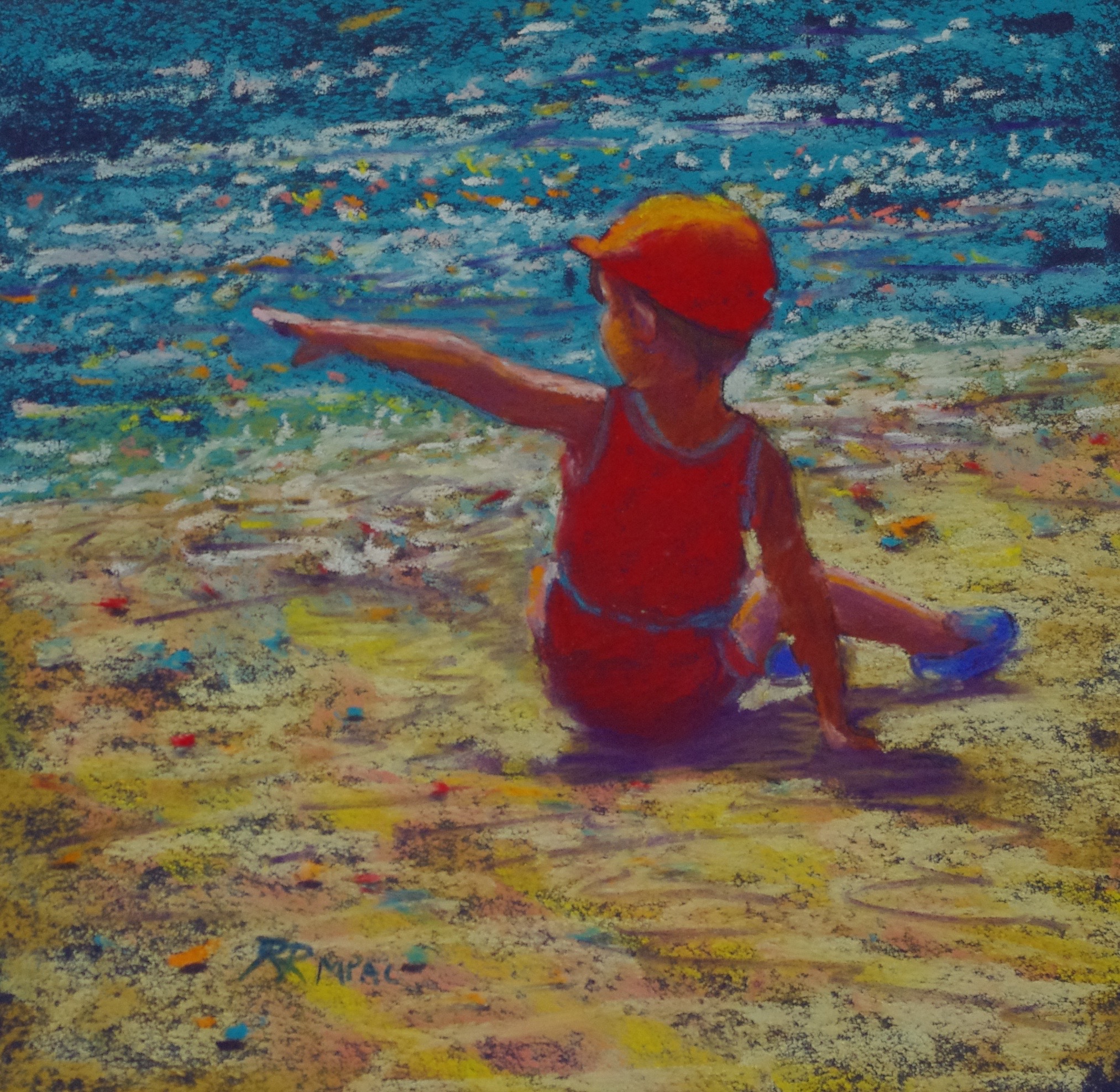
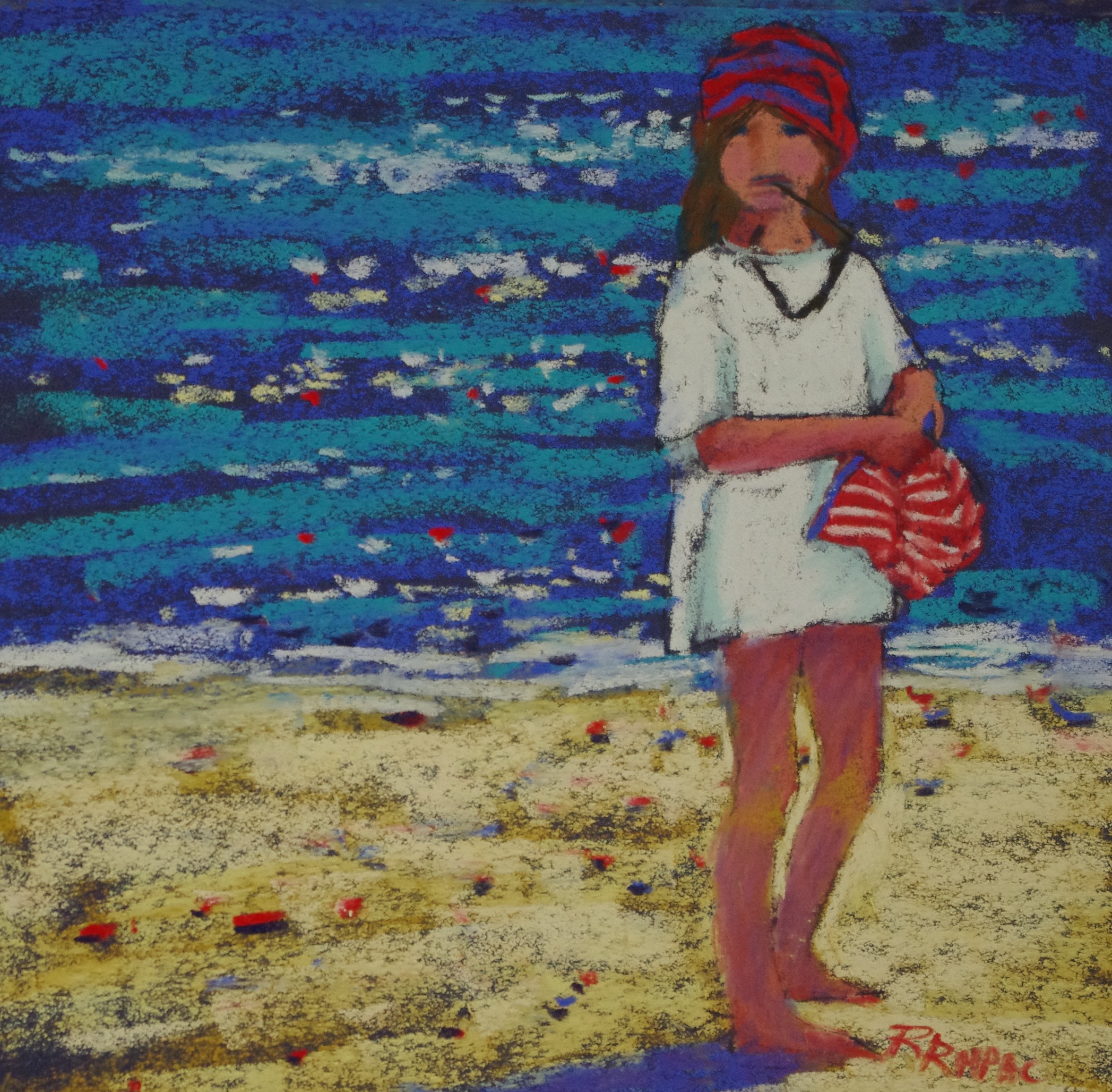
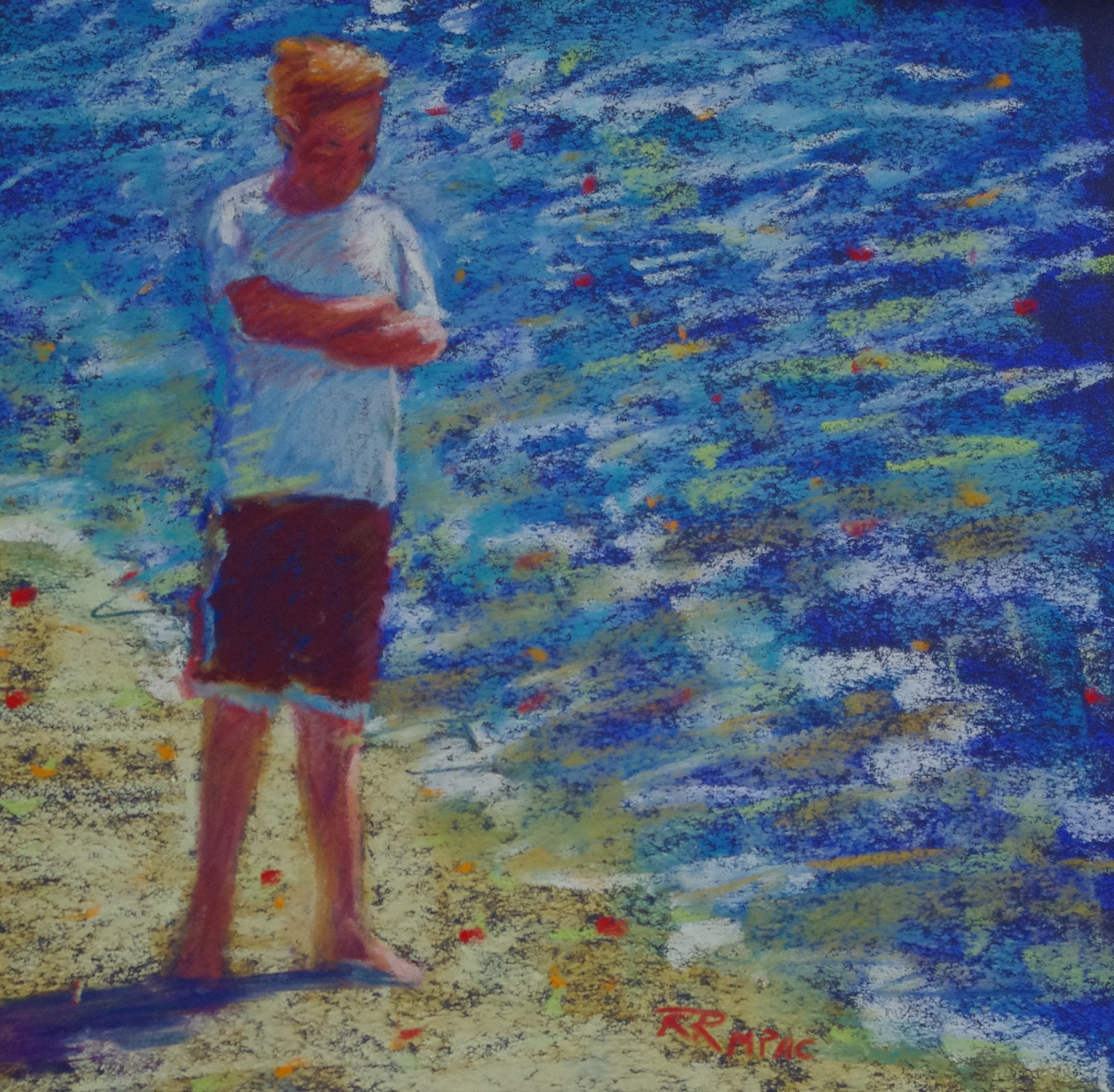
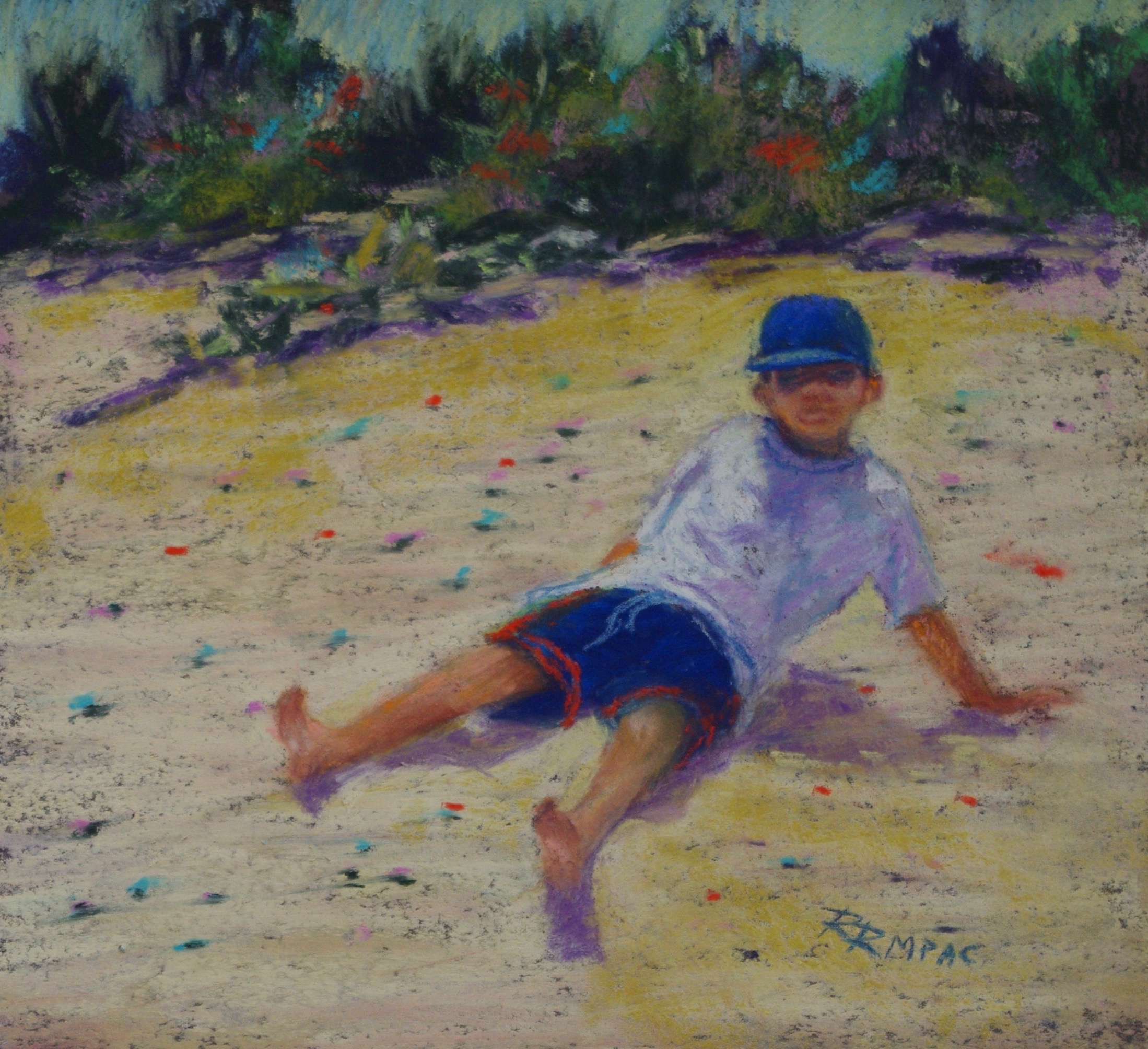
The week will be designed to review foundational painting principles and apply them to both studio and plein air painting. I will be demonstrating in pastel and acrylic, but painters in any medium are welcome. This session will be suitable for any level, beginner to advanced.
Spaces are limited, so contact me (rodgers.ruth@gmail.com) to reserve your spot soon!