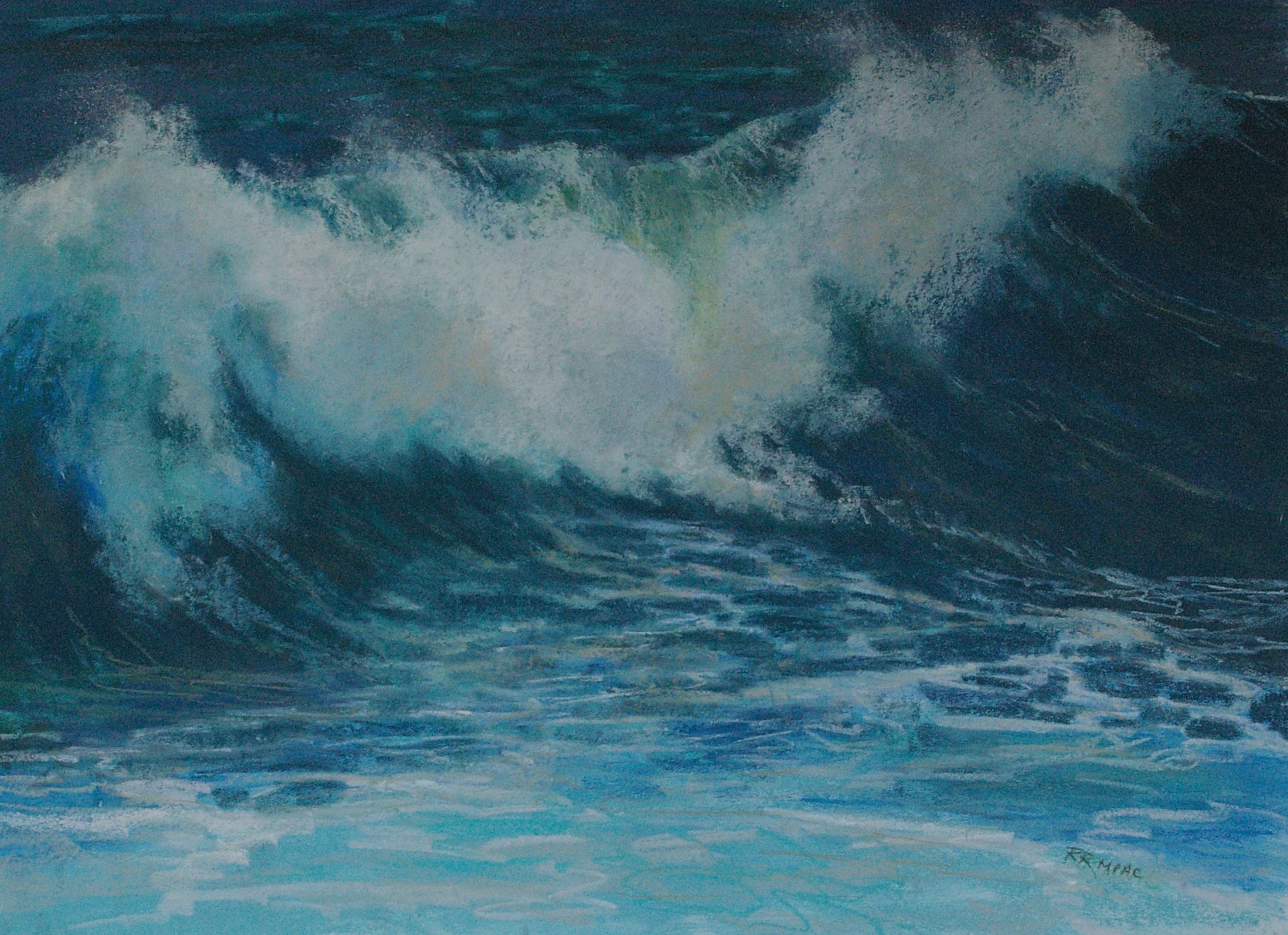
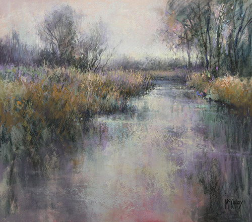
Note how little range there is in the dark-to-light scale. Almost all the colours he used are in the mid-to-low value range, with a slightly lighter value in the sky and the small areas of water where he wants higher value contrast against the dark edge of the bank. Again, the effect is quiet and subtle, helping us as viewers to appreciate this gentle scene. It's not a screaming parade---it's a lilting lullaby.
If you are using liquid pigment (watercolour, acrylic, oil) as opposed to pastels, you can mix an infinite range of beautiful greys to suit your needs. Yes, you can, of course, begin by mixing black and white in various proportions. But these greys are often flat and rather dead.
Instead, try mixing complementary colours (violet/yellow; blue/orange; red/green) in various proportions, and then add a small amount of white or black to adjust the value of the resulting grey. As you will see through experimentation, a huge range of neutral greys is thus obtained.
In a recent lesson in acrylic, I used this technique to produce my demo painting. The only paints used in this painting were naples yellow, light blue violet, black and white. As you can see, a full range of warm and cool greys were produced just from these four colours.