New membership: Federation of Canadian Artists

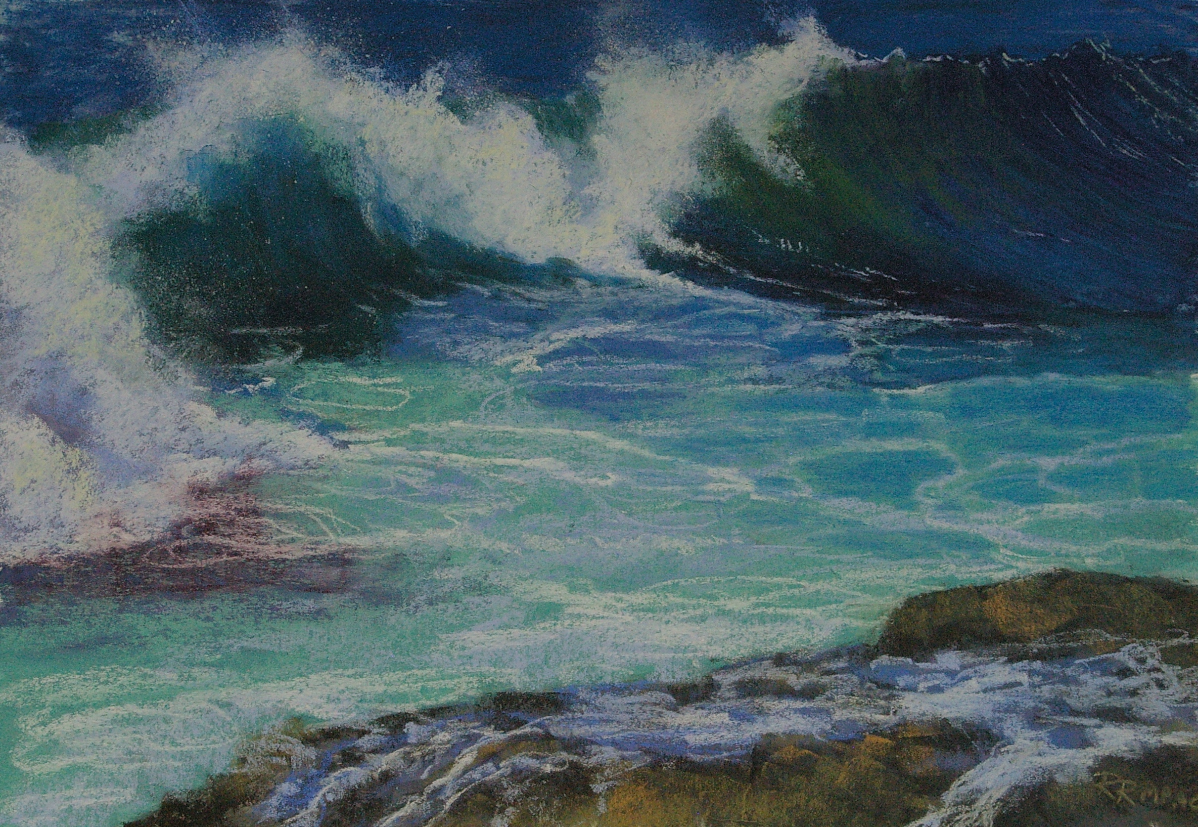
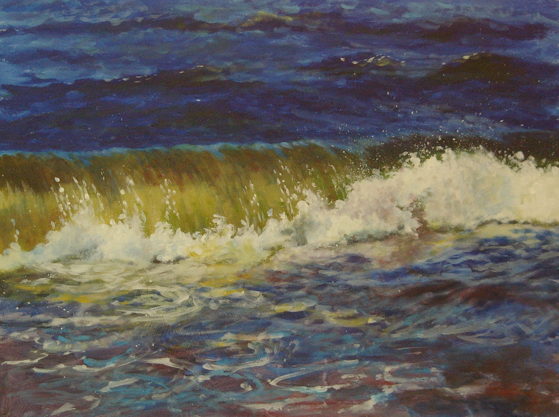
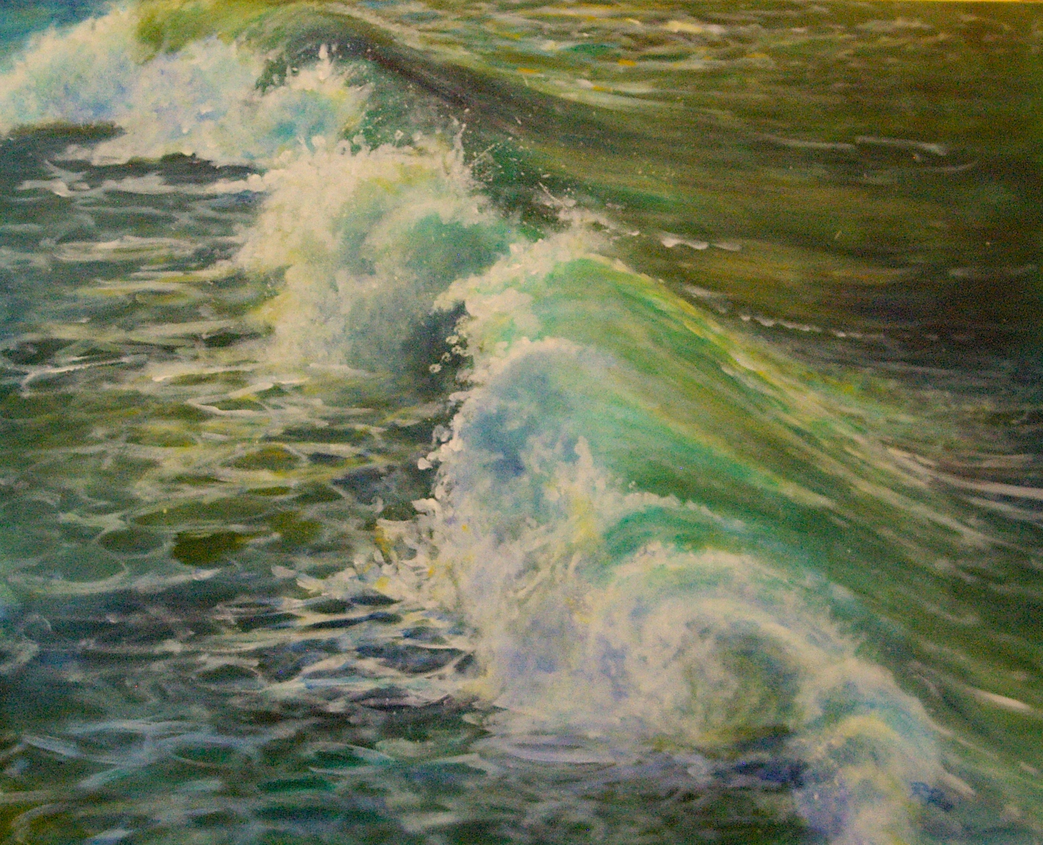
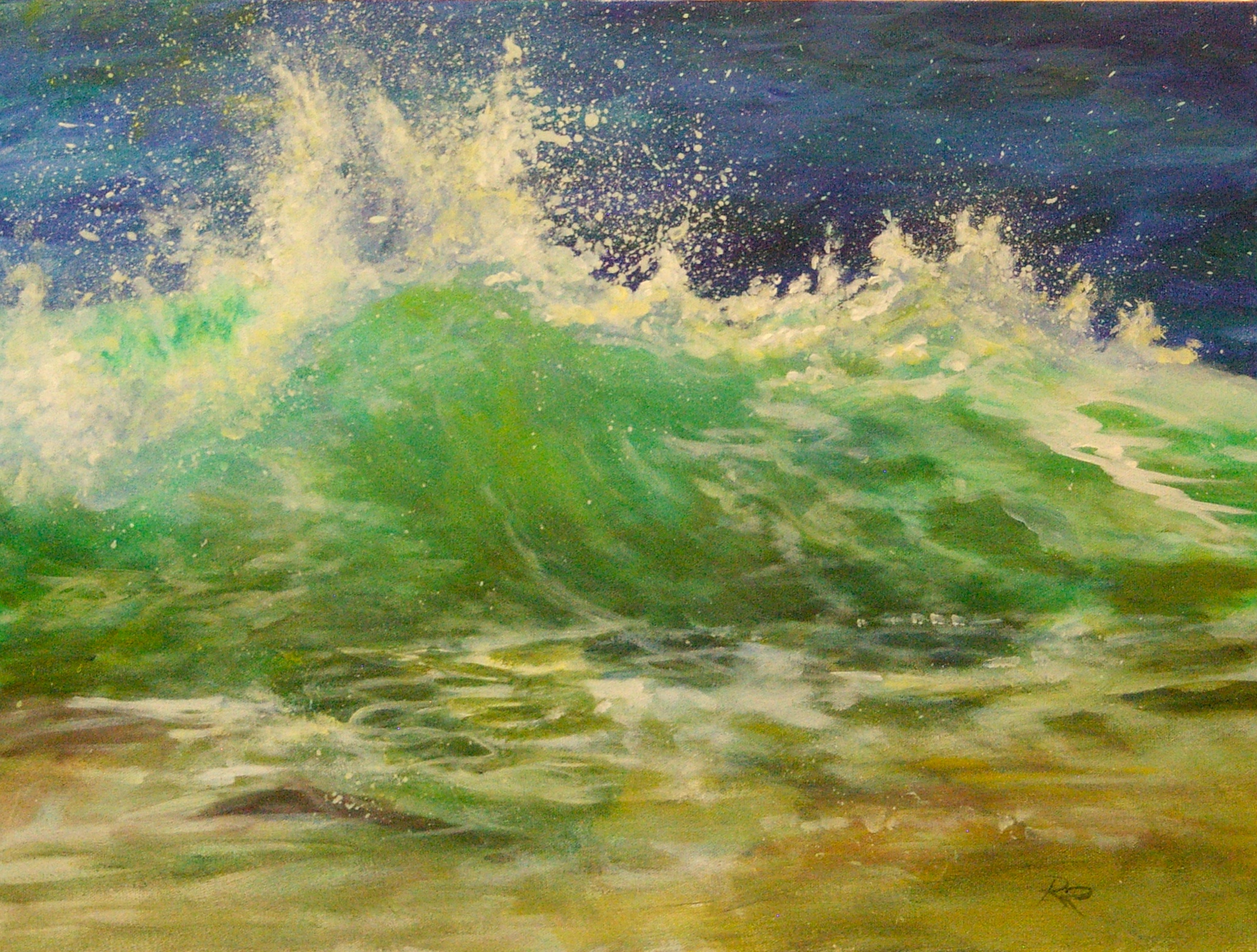
I am delighted to report that I have successfully navigated the jurying process to be accepted as an active member of the Federation of Canadian Artists.  This association provides a great promotional opportunity for me via their bricks and mortar gallery on Vancouver's Granville Island, where I hope to show more of my work on an ongoing basis.  I'm pretty pumped to be a member of a society that once counted Lawren Harris among its members! The FCA also provides a variety of other services, as follows:

OUR MISSION STATEMENT

The mission of the FCA is to advance the knowledge and appreciation of art and culture to all Canadians, offering education, exhibition and communication in the Visual Arts, and to support and promote emerging  to professional member artists.

WHO WE ARE

The Federation of Canadian Artists (FCA) was founded in 1941 by a group of Canadian artists, including the Group of Seven luminary, Lawren Harris. The FCA continues to operate as a registered not for profit society with members throughout the world and Chapters in Western Canada. The FCA is dedicated to raising artistic standards by stimulating participants to greater heights of knowledge and achievement by offering what is believed to be the first completely artists sponsored gallery in Canada.  The Federation Gallery is located on Granville Island, Vancouver, BC, featuring bi-monthly juried exhibitions of works by emerging and Signature members as well as two juried international shows held annually, Painting on the Edge and AIRS. The FCA also holds special collaborative shows with other art societies. An extensive education program which is open to non-members as well as members, offering workshops, classes, critiques and lectures in the fine arts media, with instruction by successful established artists who can help all artists to explore and develop their artistic interest and talent. Membership in the FCA is open to all who appreciate art.


2015_Active_Badge

Adding texture at the ground level

In recent pastel and acrylic lessons, we have been examining how to create texture in our paintings. While there are a variety of visual illusion techniques that can be used in both media, another option is to actually create 3-D texture at the ground or support level.  This technique can be used on both card/paper supports for pastel and on panel/canvas supports for acrylic. First, sketch the main shapes of your design onto your support in light pencil lines so that you can create different textures in different areas (grasses, mountains, water, trees, sky etc.). Use white gesso at its full strength (i.e. undiluted, out of the jar or bucket, not the thinner pourable kind) and a cheap paintbrush of an appropriate size for your size of support. Brush on a small area of gesso at a time, keeping your eventual subject matter in mind in each area: in the sky area, you might stroke on the gesso fairly thinly and in flat horizontal strokes, blending well to avoid obvious texture; in a mountainous area, you might use thick random brushstrokes to indicate tumbled rocks and rough texture; for trees, brush the gesso into shapes resembling the direction and texture of the eventual foliage--you can create quite believable conifer foliage with upward flicks of the brush in a branching pattern. In grassy areas, consider using a wood-graining tool or a stiff comb to pull vertical strokes throughout the area--shorter in the background, longer as you move forward to create depth.  The wood-graining tool can be found in decorating stores--it's a small rubber triangle with different patterns of teeth formed into each of its three sides--wider, finer etc.. Nice to have, but a couple of cheap dollar store hair combs with thick and thin teeth--or even a fork!-- will also work. The trick is to apply the gesso with one hand (your dominant hand) and pull the comb through with your non-dominant hand before the gesso sets up.  This method will create somewhat random, natural-looking grassy texture. Using your dominant hand to do it tends to create more regular, stiff looking textures. Either way, remember to turn your wrist and hand to create strokes at varied angles, not all the same orientation. The thick gesso takes awhile to dry, but this can be sped up with a hairdryer if you are impatient! Don't start painting until it is completely dry in the thickest passages.

Once your textured support is totally dry, you can begin applying the first layer of paint.  Use a thin layer in the darkest value you expect to have in each area first.  In pastel, you can apply a very thin layer of pigment (you'll note that this rough-textured surface sands your pastel down quickly, so use a light pressure and a thin coat), then wash it down with rubbing alcohol or water to stain the surface.  With acrylic, thin this base coat with water and scrub it into the textures with a stiff brush.

Once the first staining layer is down, you can begin layering other colours on top, either brushing them deep into the textures or letting them sit on top of the raised parts. Just as when doing a rubbing of a 3-D object such as a brass rubbing, you'll see the textures emerging as you add layers.  Make use of them to create the illusion (and the actuality) of a three-dimensional object.

This technique is fun and effective, but shouldn't be overdone. Keep the textures subtle and let them work for you to enhance, not overwhelm, your subject.

Here are the two demo paintings I did for these lessons:

Three Redheads, pastel on textured matboard, 16 x 20

Roll Out the Red, acrylic on textured panel, 18 x 24

Waving Hello and "Goodbye"

While at the International Association of Pastel Societies (IAPS) conference in Albuquerque N.M. in early June, I attended a wonderful hands-on workshop taught by Jeanne Rosier Smith ( http://www.jeannesmithart.com/gallery5.htm), an artist whom I have admired for some time for her fresh, evocative paintings of waves. I was delighted to discover that Jeanne is also an articulate and skilled instructor, and even more pleased to find that, following her demo and directions, I was able to create two lovely pastels of waves myself, this being my first one... IMGP7670

Ever since, I've become obsessed with painting waves in both pastel and acrylic, and am now in the process of trying one in "thread painting" (a technique similar to quilting that substitutes finely cut textiles for paint).  In fact, I've decided to focus my fall solo show at the Gibsons Public Art Gallery (opening Oct 15, 2015) on depictions of water, including lots of waves. Some of them can already be seen at The Landing Gallery in Gibsons Landing, B.C.

Here are some samples so far:

IMGP7665 IMGP7668 IMGP7671 IMGP7673 IMGP7675 IMGP7678 IMGP7680 IMGP7682 IMGP7685

On another note, I will soon be moving my website to another platform. The address will stay the same, but the hope is that it will be cleaner, easier to navigate and manage, and, of course, more attractive!  I'll let you know when the move is coming--stay tuned.

Pastels in the Landing

Three of us enjoyed a wonderfully peaceful but productive time last weekend in the spacious and well-equipped Arts Building in Gibsons Landing. My students Camilla and Valerie each completed two beautiful works, and were indulgent with me as I did a couple of small paintings myself!  The sun shone, the breezes blew, and we were happily and fully engaged in the creative process--heaven! Thanks also to Lauren Hemnes for her administrative help, and Georgina Brandon for inviting me to teach in this location. Valerie painting towering clouds on day one.

Camilla hard at work on her very first pastel painting ever.

Sorting pastels onto the colour wheel to learn about hue, value, and temperature

Valerie and her beautiful rendition of Merry Island!

Camilla and an inviting shoreline scene!

Revisiting a painting

Sometimes you finish a painting and you are "okay" with it, but something just isn't...quite...right, but you can't figure out what it is that's bothering you.  Around the Bend (below) was one of those paintings. I did it just before last year's Art Crawl, framed it, and hung it on the gallery wall in the studio.  There it sat, garnering no attention, and as the months went by it irritated me more and more. What the heck was wrong with it? around the bend

Then, last week I visited an exhibition by west coast artist Renato Muccillo at the White Rock Art Gallery (http://renatomuccillo.com/home.html) . I was extremely impressed with the works, noting that the subject matter and compositions were similar to my own.  Although I don't aspire to the technical polish evident in Muccillo's pieces, I do think I can learn a lot from his approach. One of the differences I noted  was Muccillo's level of foreground detail, and I came home determined to take another look at my own paintings with this in mind. As a result, I completed The Green Fuse, which includes much more fine detail up front than my usual work.

The Green Fuse 16 x 20 $650


As I was standing back and contemplating this piece as it neared completion, I happened to glimpse Around the Bend out of the corner of my eye and had a flash of insight...its foreground needed work!  Off the wall and onto the easel it came, and I started in on the foreground details.

And then my husband came in and commented that the perspective on the grass heights was off, so I fixed that.  And then I realized that the focal point was being divided by the presence of the TWO trees (even though the original scene had both trees, it just wasn't working), so down came the evergreen...which then allowed me to notice that the remaining tree needed re-shaping and adjustment of the values to make it more visible against the sky and background trees, using counterchange. (dark against the light sky/lighter against the dark trees behind it).

Ok, it was improving. Then I sat down with a cup of tea to judge my changes, and had the BIG realization.  At some point in the painting's evolution, I had changed the sky from a pale blue to a pale pink--and I had forgotten to change the water surface (reflecting the sky) to match!  Duh!!  Yup, THAT is what had been irritating me all along.  Can't believe I didn't catch the error in my usual final "logic check" (where I check things like angles of reflections, cast shadows etc.)!

So, I abandoned the tea and immediately repainted the water surface.  More noodling with the detail, more fixing of the grass levels. Final check revealed my usual crooked horizon (I often drop slightly as I go from left to right, and have learned to use a T-square to check, as I don't trust my eye).  Ok, fixed that..and I think I am finally satisfied! But the painting has changed so much that it needs a new name: presenting Rosy Dawn. I won't be grieving the loss of Around the Bend, as that painting nearly drove me there!  In the end, however, it was a good lesson. Given enough time, I eventually figure out what the problems are--good idea to give "near-misses" an aging period!

Rosy Dawn 20 x 16 $650